
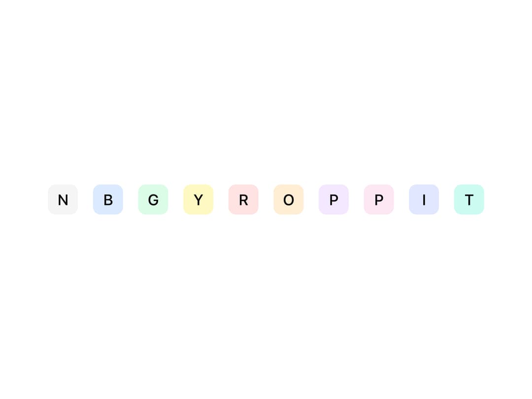
About
A user avatar that shows a photo with an initials/icon fallback, plus optional presence status dots, notification badges, and a stacked group layout for showing multiple users.
Built with React and Tailwind. Copy the prompt and paste it into Claude Code, Cursor or Lovable: your agent adds Avatar to your project and fits it to your theme.
Code
How Avatar is used: the demo's code. The component's own source comes with a free account.
Usage.tsx
import { Avatar, AvatarFallback } from "@/components/ui/avatar";

export default function AvatarColorVariantsDemo() {
  return (
    <div className="flex items-center gap-4">
      <Avatar size="md" variant="normal">
        <AvatarFallback>N</AvatarFallback>
      </Avatar>
      <Avatar size="md" variant="blue">
        <AvatarFallback>B</AvatarFallback>
      </Avatar>
      <Avatar size="md" variant="green">
        <AvatarFallback>G</AvatarFallback>
      </Avatar>
      <Avatar size="md" variant="yellow">
        <AvatarFallback>Y</AvatarFallback>
      </Avatar>
      <Avatar size="md" variant="red">
        <AvatarFallback>R</AvatarFallback>
      </Avatar>
      <Avatar size="md" variant="orange">
        <AvatarFallback>O</AvatarFallback>
      </Avatar>
      <Avatar size="md" variant="purple">
        <AvatarFallback>P</AvatarFallback>
      </Avatar>
      <Avatar size="md" variant="pink">
        <AvatarFallback>P</AvatarFallback>
      </Avatar>
      <Avatar size="md" variant="indigo">
        <AvatarFallback>I</AvatarFallback>
      </Avatar>
      <Avatar size="md" variant="teal">
        <AvatarFallback>T</AvatarFallback>
      </Avatar>
    </div>
  );
}
Dependencies
More by Mahmoud Ilyan
View all
Radio Card
Switch
Segmented Control
Checkbox