
About
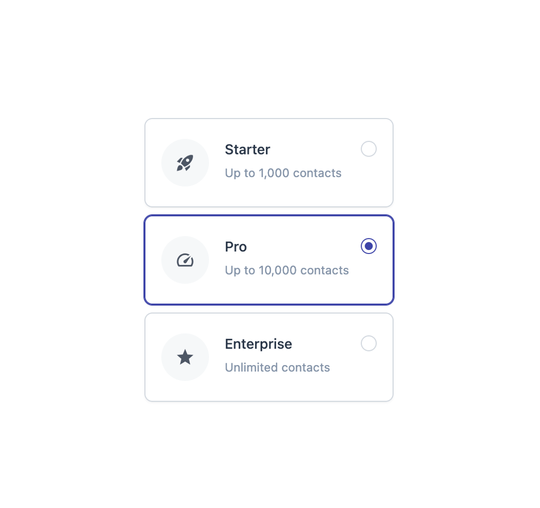
A card-style radio button group for single-selection choices, supporting an optional icon, label, description and trailing addon per option.
Built with React and Tailwind. Copy the prompt and paste it into Claude Code, Cursor or Lovable: your agent adds Radio Card to your project and fits it to your theme.
Code
How Radio Card is used: the demo's code. The component's own source comes with a free account.
Usage.tsx
import { RadioCard, RadioCardItem } from "@/components/ui/radio-card";
import { MdRocketLaunch, MdSpeed, MdStar } from "react-icons/md";

export default function RadioCardIconsDemo() {
  return (
    <RadioCard defaultValue="pro" className="max-w-md">
      <RadioCardItem
        value="starter"
        icon={<MdRocketLaunch className="size-5 text-icon" />}
        label="Starter"
        description="Up to 1,000 contacts"
      />
      <RadioCardItem
        value="pro"
        icon={<MdSpeed className="size-5 text-icon" />}
        label="Pro"
        description="Up to 10,000 contacts"
      />
      <RadioCardItem
        value="enterprise"
        icon={<MdStar className="size-5 text-icon" />}
        label="Enterprise"
        description="Unlimited contacts"
      />
    </RadioCard>
  );
}
Dependencies
More by Mahmoud Ilyan
View all
Switch
Segmented Control

Checkbox
Avatar
More in Pricing
View all

Pricing Section
197
Pricing Section
687

Pricing Card
391
Colorful-Pricing
91
pricing section
173

RuixenPricing05
114

Pricing Cards
23
Pricing Card With Features
184


