
About
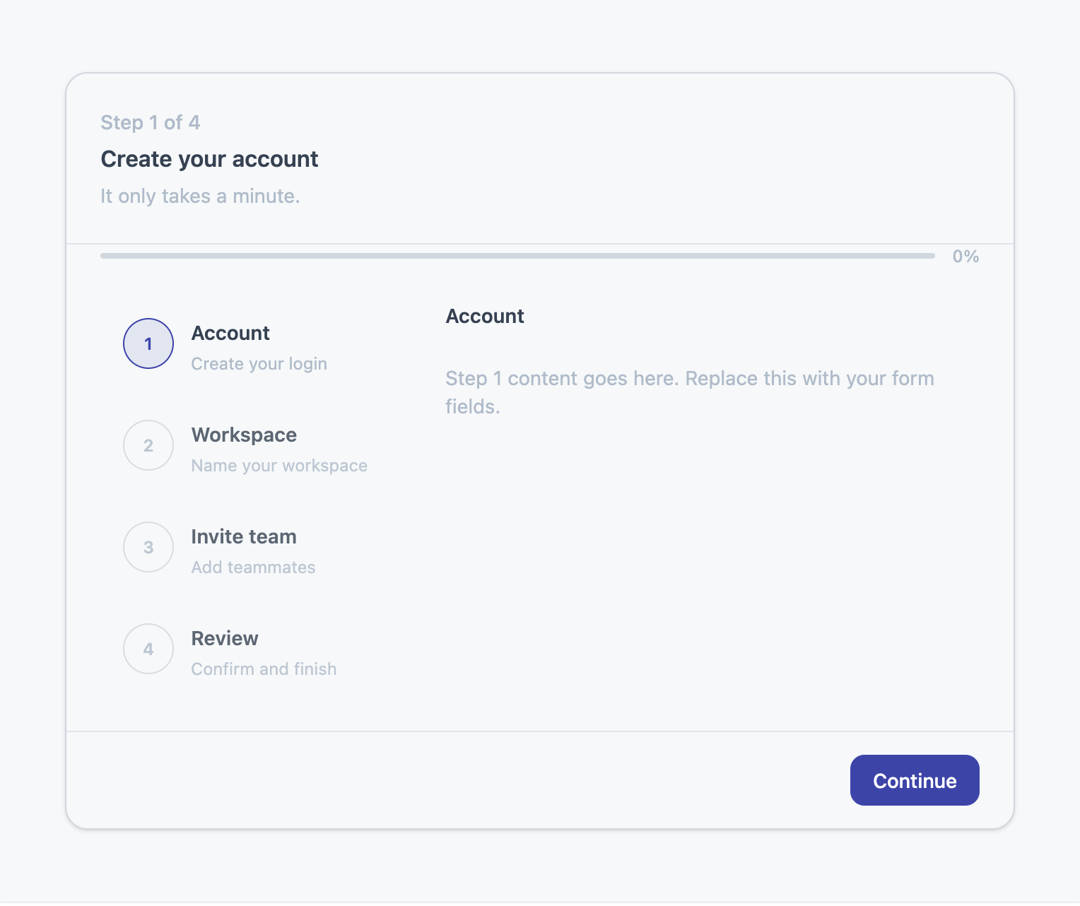
A compound multi-step indicator with a nav header, progress bar, clickable step list, step panels, and footer for building wizard-style flows.
Built with React and Tailwind. Copy the prompt and paste it into Claude Code, Cursor or Lovable: your agent adds Steps to your project and fits it to your theme.
Code
How Steps is used: the demo's code. The component's own source comes with a free account.
Usage.tsx
import * as React from "react";
import {
  StepsRoot,
  StepsContainer,
  StepsNav,
  StepsProgress,
  StepsList,
  StepsItem,
  StepsContent,
  StepsPanel,
  StepsFooter,
  StepsCompletedContent,
} from "@/components/ui/steps";

function Button({
  children,
  variant = "default",
  ...props
}: React.ButtonHTMLAttributes<HTMLButtonElement> & {
  variant?: "default" | "outline";
}) {
  return (
    <button
      type="button"
      className={
        variant === "outline"
          ? "rounded-lg border border-border bg-panel px-4 py-2 text-sm font-medium text-foreground transition hover:bg-muted"
          : "rounded-lg bg-primary px-4 py-2 text-sm font-medium text-primary-foreground transition hover:opacity-90"
      }
      {...props}
    >
      {children}
    </button>
  );
}

const steps = [
  { label: "Account", description: "Create your login" },
  { label: "Workspace", description: "Name your workspace" },
  { label: "Invite team", description: "Add teammates" },
  { label: "Review", description: "Confirm and finish" },
];

export default function StepsDemo() {
  const [activeStep, setActiveStep] = React.useState(0);
  const isDone = activeStep >= steps.length;

  return (
    <div className="flex w-full items-center justify-center bg-background p-6">
      <StepsRoot
        className="w-full max-w-2xl"
        activeStep={Math.min(activeStep, steps.length - 1)}
        totalSteps={steps.length}
        onStepChange={setActiveStep}
      >
        <StepsContainer>
          <StepsNav
            title="Create your account"
            subtitle="It only takes a minute."
          />
          <StepsProgress />

          <div className="grid gap-6 px-6 py-6 md:grid-cols-[220px_1fr]">
            <StepsList>
              {steps.map((step) => (
                <StepsItem
                  key={step.label}
                  label={step.label}
                  description={step.description}
                />
              ))}
            </StepsList>

            <StepsContent>
              {isDone ? (
                <StepsCompletedContent />
              ) : (
                steps.map((step, index) => (
                  <StepsPanel key={step.label}>
                    <h3 className="text-sm font-semibold text-foreground">
                      {step.label}
                    </h3>
                    <p className="text-sm text-muted-foreground">
                      Step {index + 1} content goes here. Replace this with your
                      form fields.
                    </p>
                  </StepsPanel>
                ))
              )}
            </StepsContent>
          </div>

          {!isDone && (
            <StepsFooter
              secondaryAction={
                activeStep > 0 ? (
                  <Button
                    variant="outline"
                    onClick={() =>
                      setActiveStep((step) => Math.max(step - 1, 0))
                    }
                  >
                    Back
                  </Button>
                ) : null
              }
              actions={
                <Button onClick={() => setActiveStep((step) => step + 1)}>
                  {activeStep === steps.length - 1 ? "Finish" : "Continue"}
                </Button>
              }
            />
          )}
        </StepsContainer>
      </StepsRoot>
    </div>
  );
}
Dependencies
More by Mahmoud Ilyan
View all
Radio Card
1
Switch
Textarea
Segmented Control

Checkbox
Avatar