
About
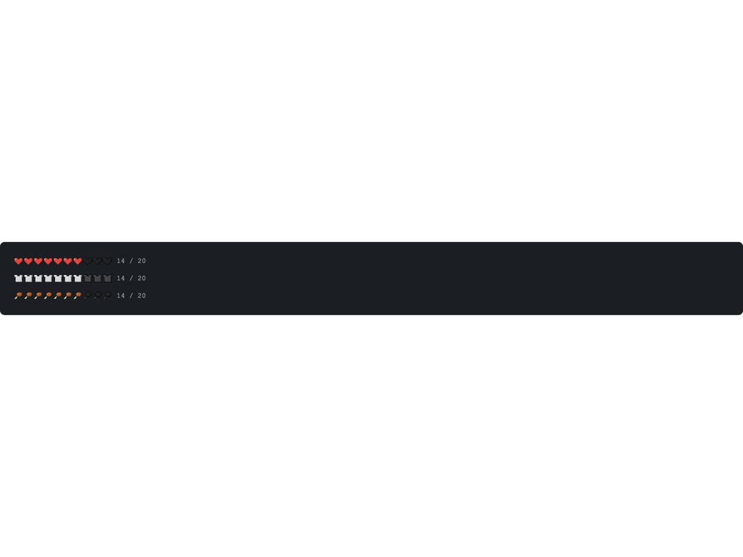
A row of pixel-art icons (hearts, armor, drumsticks, etc.) where each icon represents two points, used to render game HUD meters like health, armor or hunger bars.
Built with React and Tailwind. Copy the prompt and paste it into Claude Code, Cursor or Lovable: your agent adds Points Bar to your project and fits it to your theme.
Code
How Points Bar is used: the demo's code. The component's own source comes with a free account.
Usage.tsx
import PointsBar from "@/components/ui/points-bar";
import { HeartIcon, ArmorIcon, FoodIcon } from "@malilion/block-ui-icons";

export default function PointsBarDemo() {
  return (
    <div
      className="flex w-full flex-col gap-3 rounded-md p-6"
      style={{ background: "var(--block-bg)", color: "var(--block-text)" }}
    >
      <PointsBar
        value={14}
        max={20}
        label="Health"
        lowThreshold={0.2}
        icon={<HeartIcon size={16} />}
        showText
      />
      <PointsBar
        value={14}
        max={20}
        label="Armor"
        lowThreshold={0}
        icon={<ArmorIcon size={16} />}
        showText
      />
      <PointsBar
        value={14}
        max={20}
        label="Hunger"
        lowThreshold={0.2}
        icon={<FoodIcon size={16} />}
        showText
      />
    </div>
  );
}
Dependencies
More by malilion
View all
Block Grid
Block Slider