
About
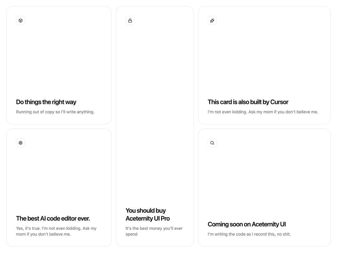
A border glowing effect that adapts to any container or card, as seen on Cursor's website
Built with React and Tailwind. Copy the prompt and paste it into Claude Code, Cursor or Lovable: your agent adds Glowing Effect to your project and fits it to your theme.
Code
How Glowing Effect is used: the demo's code. The component's own source comes with a free account.
Usage.tsx
"use client";

import { Box, Lock, Search, Settings, Sparkles } from "lucide-react";
import { GlowingEffect } from "@/components/ui/glowing-effect";

const settings = {
  blur: 0,
  spread: 40,
  proximity: 64,
  inactiveZone: 0.01,
  borderWidth: 3,
};

export default function Demo(props: Partial<typeof settings>) {
  const s = { ...settings, ...props };

  return (
    <div className="h-screen w-screen p-6">
      <ul className="grid grid-cols-1 grid-rows-none gap-4 md:grid-cols-12 md:grid-rows-3 lg:gap-4 xl:grid-rows-2 h-full">
        <GridItem
          settings={s}
          area="md:[grid-area:1/1/2/7] xl:[grid-area:1/1/2/5]"
          icon={<Box className="h-4 w-4" />}
          title="Do things the right way"
          description="Running out of copy so I'll write anything."
        />
        <GridItem
          settings={s}
          area="md:[grid-area:1/7/2/13] xl:[grid-area:2/1/3/5]"
          icon={<Settings className="h-4 w-4" />}
          title="The best AI code editor ever."
          description="Yes, it's true. I'm not even kidding. Ask my mom if you don't believe me."
        />
        <GridItem
          settings={s}
          area="md:[grid-area:2/1/3/7] xl:[grid-area:1/5/3/8]"
          icon={<Lock className="h-4 w-4" />}
          title="You should buy Aceternity UI Pro"
          description="It's the best money you'll ever spend"
        />
        <GridItem
          settings={s}
          area="md:[grid-area:2/7/3/13] xl:[grid-area:1/8/2/13]"
          icon={<Sparkles className="h-4 w-4" />}
          title="This card is also built by Cursor"
          description="I'm not even kidding. Ask my mom if you don't believe me."
        />
        <GridItem
          settings={s}
          area="md:[grid-area:3/1/4/13] xl:[grid-area:2/8/3/13]"
          icon={<Search className="h-4 w-4" />}
          title="Coming soon on Aceternity UI"
          description="I'm writing the code as I record this, no shit."
        />
      </ul>
    </div>
  );
}

interface GridItemProps {
  area: string;
  icon: React.ReactNode;
  title: string;
  description: React.ReactNode;
  settings: typeof settings;
}

const GridItem = ({
  area,
  icon,
  title,
  description,
  settings,
}: GridItemProps) => {
  return (
    <li className={`min-h-[14rem] list-none ${area}`}>
      <div className="relative h-full rounded-2xl border p-2 md:rounded-3xl md:p-3">
        <GlowingEffect
          blur={settings.blur}
          spread={settings.spread}
          proximity={settings.proximity}
          inactiveZone={settings.inactiveZone}
          borderWidth={settings.borderWidth}
          glow={true}
          disabled={false}
        />
        <div className="relative flex h-full flex-col justify-between gap-6 overflow-hidden rounded-xl border-0.75 p-6 md:p-6 bg-background">
          <div className="relative flex flex-1 flex-col justify-between gap-3">
            <div className="w-fit rounded-lg border border-border p-2 text-foreground">
              {icon}
            </div>
            <div className="space-y-3">
              <h3 className="pt-0.5 text-xl leading-[1.375rem] font-semibold font-sans tracking-[-0.04em] md:text-2xl md:leading-[1.875rem] text-balance text-foreground">
                {title}
              </h3>
              <h2 className="font-sans text-sm leading-[1.125rem] md:text-base md:leading-[1.375rem] text-muted-foreground">
                {description}
              </h2>
            </div>
          </div>
        </div>
      </div>
    </li>
  );
};
Dependencies
More by Manu Arora
View all
Container Scroll Animation
10.2K
Aurora Background
4.4K
Timeline
4.3K
Sparkles
4.1K
Lamp
3.7K
Sidebar
3.6K
Bento Grid
2.7K
Link Preview
2.1K
More in Features
View all

Features 8
3K

Feature Sections
52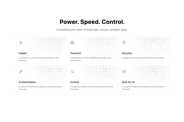

Grid Feature Cards
1.9K
Features Card
199
Feature with image
149
Feature Modern
20
Features 1
278
Feature with advantages
278


