
About
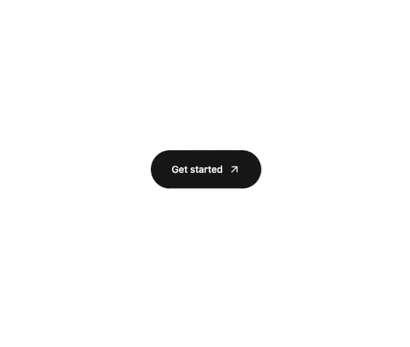
Bouton pill avec fleche qui suit le curseur sur 360 degres
Built with React and Tailwind. Copy the prompt and paste it into Claude Code, Cursor or Lovable: your agent adds Get Started Button to your project and fits it to your theme.
Code
How Get Started Button is used: the demo's code. The component's own source comes with a free account.
Usage.tsx
import GetStartedButton from "@/components/ui/get-started-button";

export default function GetStartedButtonDemo() {
  return (
    <div className="flex min-h-[240px] w-full items-center justify-center bg-background p-8">
      <GetStartedButton onClick={() => console.log("clicked")} />
    </div>
  );
}
More by Marcellin Leclercq
View all
Prompt Bar
73
More in Buttons
View all
Texture Button
105
Native Button
2

HeroUI Button Group

Button
12
Button Group

Button
35

Button
6

Notification Button
115


