
About
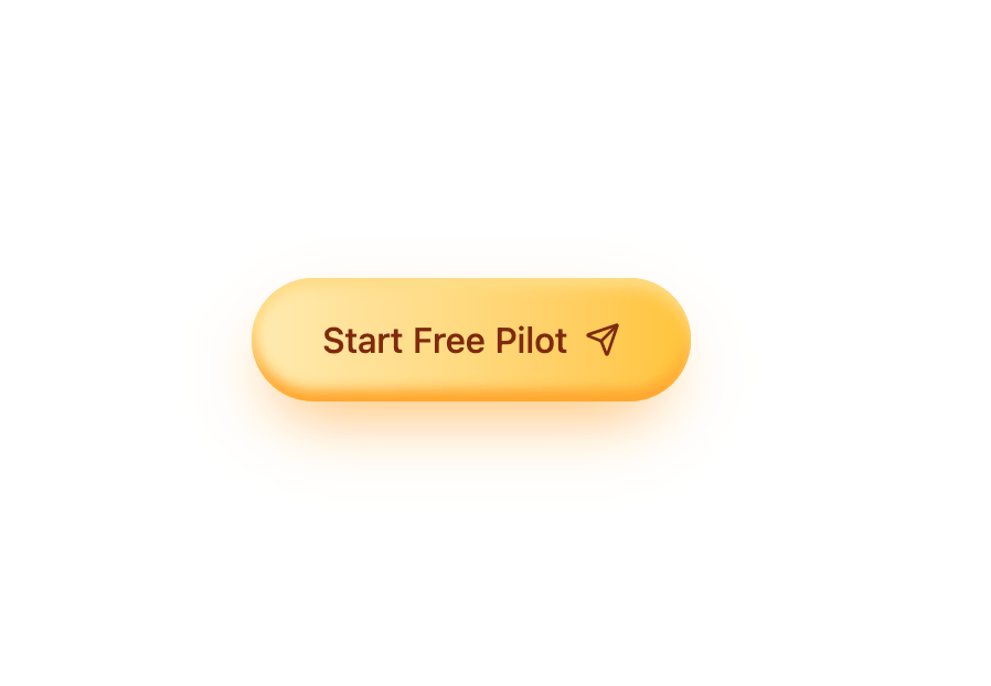
A pill-shaped call-to-action button with a warm orange gradient, layered inset shadows, and a hover-triggered fill overlay plus a send icon.
Built with React and Tailwind. Copy the prompt and paste it into Claude Code, Cursor or Lovable: your agent adds Gradient CTA Button to your project and fits it to your theme.
Code
How Gradient CTA Button is used: the demo's code. The component's own source comes with a free account.
Usage.tsx
import GradientCta from "@/components/ui/gradient-cta";

export default function GradientCtaDemo() {
  return (
    <div className="flex min-h-[240px] w-full items-center justify-center bg-background">
      <GradientCta />
    </div>
  );
}
Dependencies
More in Buttons
View all
Button
10

Button
1
Native Button
12

Eclipse Button
42
Texture Button
103
Button

Button
77
Split Button
15


