
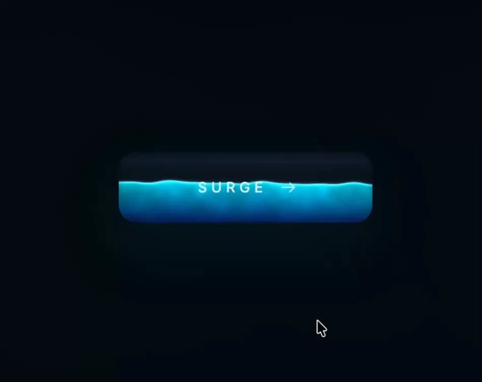
About
An interactive dark liquid-fill call-to-action button with a WebGL ripple/sloshing shader that reacts to cursor movement and clicks, delivered as a self-contained isolated embed.
Built with React and Tailwind. Copy the prompt and paste it into Claude Code, Cursor or Lovable: your agent adds Tactile Button to your project and fits it to your theme.
Code
How Tactile Button is used: the demo's code. The component's own source comes with a free account.
Usage.tsx
import TactileButton from "@/components/ui/tactile-button";

export default function TactileButtonDemo() {
  return (
    <div className="h-[420px] w-full overflow-hidden">
      <TactileButton className="h-full w-full" />
    </div>
  );
}
More by Meng To
View all
Gateway Flow
1.9K
Glassmorphism CTA
841
Globe Type Study
772
Particle Drift
733
Generative Tree
637
Topo Field
605
Dot Border Button
517
Spark Badge
492
More in Shaders
View all
Glass Fold
437

Shader Animation
3.8K

Illos Knowledge Sources
43
Wave
715

Phosphor 30
308
Black Hole
41

Warp Carousel
686

Paper design shader Background
696
