
About
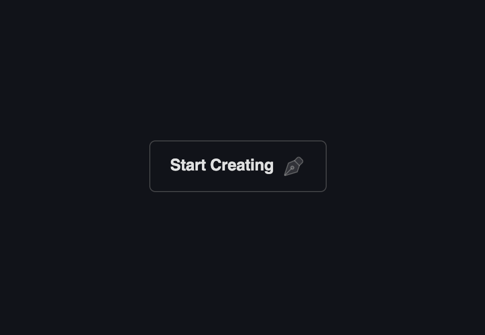
An animated call-to-action button whose four corner dots and dashed border segments draw themselves in sequence on hover.
Built with React and Tailwind. Copy the prompt and paste it into Claude Code, Cursor or Lovable: your agent adds Dot Border Button to your project and fits it to your theme.
Code
How Dot Border Button is used: the demo's code. The component's own source comes with a free account.
Usage.tsx
import DotBorderButton from "@/components/ui/dot-border-button";

export default function DotBorderButtonDemo() {
  return (
    <div className="flex h-[420px] w-full items-center justify-center overflow-hidden rounded-xl border border-border bg-[#111318]">
      <DotBorderButton mode="dark" className="h-full w-full" />
    </div>
  );
}
More by Meng To
View all
Gateway Flow
1.9K
Glassmorphism CTA
841
Globe Type Study
772
Particle Drift
735
Generative Tree
638
Topo Field
607
Spark Badge
492
Woven Cloth
370
More in Buttons
View all
Texture Button
104
Button
12
Native Button
27

Button
19
Button
78

HeroUI Button Group
5
Button
1

Button
67


