
About
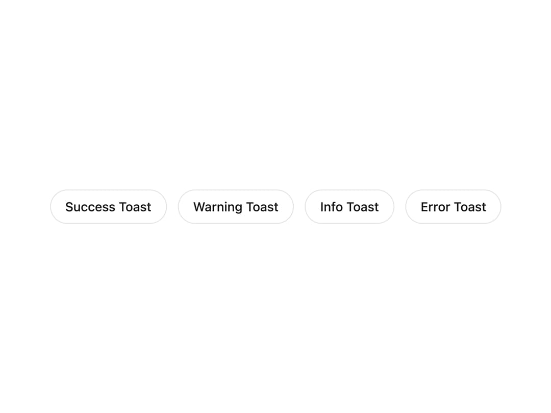
A centered, bottom-anchored toast notification system that pops up title-only pills with an icon and auto-dismiss, triggered imperatively from anywhere in the app via a single global function. Ported from the Astro ai-ui component by Michael Vereb.
Built with React and Tailwind. Copy the prompt and paste it into Claude Code, Cursor or Lovable: your agent adds Toaster to your project and fits it to your theme.
Code
How Toaster is used: the demo's code. The component's own source comes with a free account.
Usage.tsx
"use client";

import Toaster from "@/components/ui/toaster";

type Variant = "success" | "warning" | "info" | "error";

export default function ToasterDemo() {
  const fire = (variant: Variant, title: string) => {
    (window as any).aiToast?.({ title, variant });
  };

  return (
    <div className="relative flex h-screen w-full flex-wrap items-center justify-center gap-3 bg-white px-6 text-zinc-900">
      <button
        type="button"
        onClick={() => fire("success", "Success Toast")}
        className="rounded-full border border-zinc-200 px-4 py-2 text-sm font-medium text-zinc-900 transition hover:border-zinc-300"
      >
        Success Toast
      </button>
      <button
        type="button"
        onClick={() => fire("warning", "Warning Toast")}
        className="rounded-full border border-zinc-200 px-4 py-2 text-sm font-medium text-zinc-900 transition hover:border-zinc-300"
      >
        Warning Toast
      </button>
      <button
        type="button"
        onClick={() => fire("info", "Info Toast")}
        className="rounded-full border border-zinc-200 px-4 py-2 text-sm font-medium text-zinc-900 transition hover:border-zinc-300"
      >
        Info Toast
      </button>
      <button
        type="button"
        onClick={() => fire("error", "Error Toast")}
        className="rounded-full border border-zinc-200 px-4 py-2 text-sm font-medium text-zinc-900 transition hover:border-zinc-300"
      >
        Error Toast
      </button>

      <Toaster />
    </div>
  );
}
More by michaelvereb
View all
Feedback Bar
7
AI Loader
2