
About
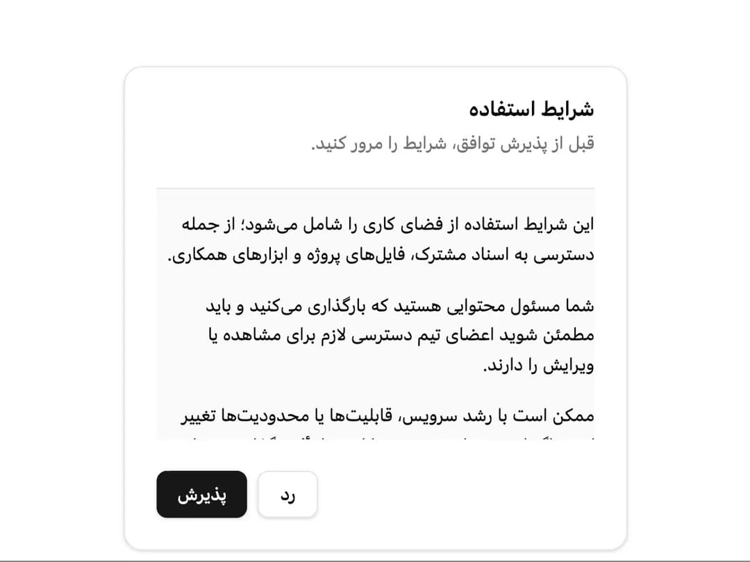
A content container with header, title, description, action, body and footer sections, built RTL-first for Farsi interfaces (e.g. a login form or an event card).
Built with React and Tailwind. Copy the prompt and paste it into Claude Code, Cursor or Lovable: your agent adds Card to your project and fits it to your theme.
Code
How Card is used: the demo's code. The component's own source comes with a free account.
Usage.tsx
import { Button } from "@/components/ui/button";
import {
Card,
CardContent,
CardDescription,
CardFooter,
CardHeader,
CardTitle,
} from "@/components/ui/card";
export default function CardEdgeToEdge() {
return (
<Card className="mx-auto w-full max-w-sm" dir="rtl">
<CardHeader>
<CardTitle>شرایط استفاده</CardTitle>
<CardDescription>
قبل از پذیرش توافق، شرایط را مرور کنید.
</CardDescription>
</CardHeader>
<CardContent className="-mb-(--card-spacing)">
<div className="-mx-(--card-spacing) max-h-48 space-y-4 overflow-y-scroll border-t bg-muted/50 px-(--card-spacing) py-4 text-sm leading-relaxed">
<p>
این شرایط استفاده از فضای کاری را شامل میشود؛ از جمله دسترسی به
اسناد مشترک، فایلهای پروژه و ابزارهای همکاری.
</p>
<p>
شما مسئول محتوایی هستید که بارگذاری میکنید و باید مطمئن شوید اعضای
تیم دسترسی لازم برای مشاهده یا ویرایش را دارند.
</p>
<p>
ممکن است با رشد سرویس، قابلیتها یا محدودیتها تغییر کنند. اگر این
تغییرات روی روند کار شما تأثیر بگذارد، مدیران فضای کاری مطلع
میشوند.
</p>
<p>
با ادامه، میپذیرید اطلاعات ورودتان را امن نگه دارید و قوانین
استفاده سازمان را رعایت کنید.
</p>
</div>
</CardContent>
<CardFooter className="justify-end gap-2">
<Button variant="outline">رد</Button>
<Button>پذیرش</Button>
</CardFooter>
</Card>
);
}
More by miladjoodi
View all
Image Diff Slider
1
Drag Scroll
Context Menu
More in Cards
View all

Course Design Cards
1.1K

Interactive Tech Stack Bento Grid with Hover Effects
294

Card Studio
10

Statistics Card 2
281
Statistics Card 10
274
Stats cards with links
40
Card
57
The Item one
3
