
About
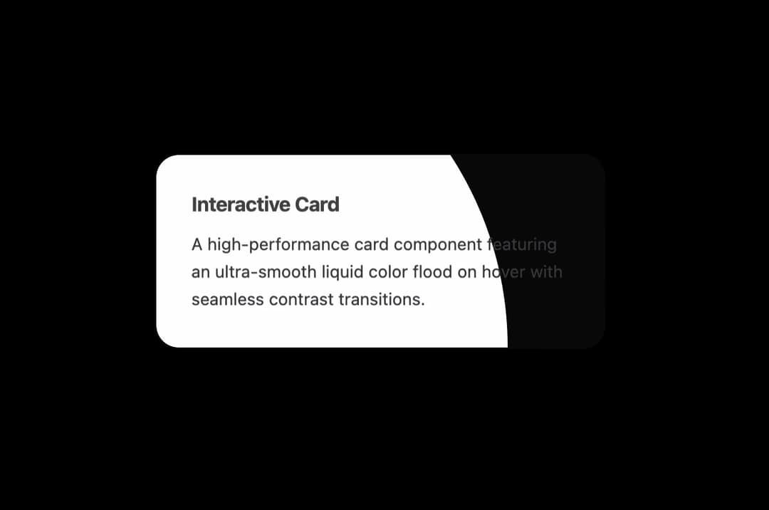
A high-performance card component featuring an ultra-slow, cinematic radial color flood on hover with seamless contrast transitions.
Built with React and Tailwind. Copy the prompt and paste it into Claude Code, Cursor or Lovable: your agent adds Color Fill Card to your project and fits it to your theme.
Code
How Color Fill Card is used: the demo's code. The component's own source comes with a free account.
Usage.tsx
import React from "react";
import ColorFillCard from "@/components/ui/color-fill-card";

export default function ColorFillCardDemo() {
  return (
    <div className="flex min-h-[420px] w-full items-center justify-center bg-black p-8">
      <ColorFillCard
        title="Interactive Card"
        description="A high-performance card component featuring an ultra-smooth liquid color flood on hover with seamless contrast transitions."
        baseColor="#080808"
        fillColor="#ffffff"
        textColor="#ffffff"
        fillTextColor="#000000"
        secondaryTextColor="#a1a1aa"
        fillSecondaryTextColor="#18181b"
        origin="bottom-left"
        duration={2400}
        lift={-4}
        className="w-full max-w-[360px]"
      />
    </div>
  );
}
More in Cards
View all
Stats cards with links
40

Course Design Cards
1.2K

Interactive Tech Stack Bento Grid with Hover Effects
421

Card Studio
14

Statistics Card 2
293
Statistics Card 7
311
The Item one
3
Card
70
