
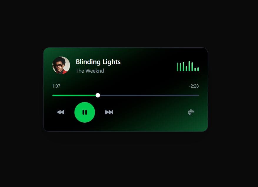
A sleek, fully functional music player component built with React and Tailwind CSS, inspired by Spotify's modern dark theme design. Features real-time playback controls, animated volume bars, a dynamic progress bar, and smooth hover effects. The component includes play/pause functionality, time tracking, and responsive design with Spotify's signature green accent color. Perfect for music streaming apps, portfolio projects, or any application requiring a professional audio player interface. Key Features: Real-time progress tracking and time display Interactive play/pause with animated volume visualizer Spotify-inspired dark theme with green accents Fully responsive design with smooth animations Built with React hooks and Tailwind CSS No external dependencies required
Built with React and Tailwind. Copy the prompt and paste it into Claude Code, Cursor or Lovable: your agent adds Spotify-Style Music Player Component to your project and fits it to your theme.
Code
How Spotify-Style Music Player Component is used: the demo's code. The component's own source comes with a free account.
Usage.tsx
import SpotifyMusicPlayer from "@/components/ui/spotify-style-music-player-component";

export default function DemoOne() {
  return <SpotifyMusicPlayer />;
}
More by M.bin Salman
View all

Ethereal Beams Hero
1.1K
Rainbow Borders Button
468
Waitlist Landing Page with Countdown Timer
354
Shiny Button
349
Shiny Borders Button
324
Stardust Button
286
Shiny Button
273
Boxy App Icons
168