
About
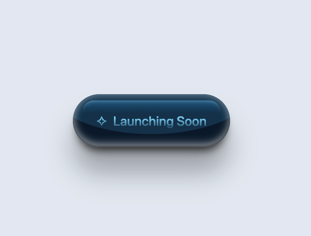
A premium pearl-finish button with celestial star animations and glass morphism effects. Features smooth hover transitions between star symbols (✧ ↔ ✦) and satisfying tactile press feedback. Perfect for launch pages, premium CTAs, and high-end product announcements.
Built with React and Tailwind. Copy the prompt and paste it into Claude Code, Cursor or Lovable: your agent adds Stardust Button to your project and fits it to your theme.
Code
How Stardust Button is used: the demo's code. The component's own source comes with a free account.
Usage.tsx
import { StardustButtonDemo } from "@/components/ui/stardust-button";

export default function DemoOne() {
  return <StardustButtonDemo />;
}
More by M.bin Salman
View all

Ethereal Beams Hero
1.1K
Rainbow Borders Button
470
Waitlist Landing Page with Countdown Timer
358
Shiny Button
351
Shiny Borders Button
324
Shiny Button
275
Boxy App Icons
170
Quantam Mysh Hero
149
More in Buttons
View all
Texture Button
108
Button
14

Notification Button
117

HeroUI Button Group
2

Eclipse Button
44
Button Save
50

App Store Button
484

Base Button
1


