
About
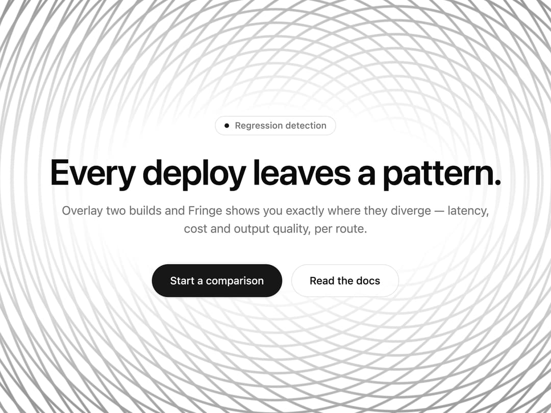
Hero background built from two identical ring rulings — one anchored, one following your pointer — whose interference redraws moiré fringes across the whole field. Two CSS gradient layers: no canvas, no WebGL, no dependencies, theme color, static under reduced motion.
Built with React and Tailwind. Copy the prompt and paste it into Claude Code, Cursor or Lovable: your agent adds Moiré Field to your project and fits it to your theme.
Code
How Moiré Field is used: the demo's code. The component's own source comes with a free account.
Usage.tsx
"use client"

// Relative import on purpose: the 21st CLI rewrites it to the published path (`@/components/ui/<slug>`)
// and to a temporary path during `21st render`. An absolute "@/…" import breaks the render build.
import { MoireField } from "@/components/ui/moire-field"

// Module-level `settings` + a default export that accepts them as props gives this demo a live controls
// panel on 21st.dev. Signature parameters first, then look, then copy.
const settings = {
  pitch: 18,
  duty: 0.18,
  detune: 3.6,
  intensity: 0.42,
  drift: 0.55,
  fade: 0.45,
  accent: false,
  eyebrow: "Regression detection",
  headline: "Every deploy leaves a pattern.",
  subline:
    "Overlay two builds and Fringe shows you exactly where they diverge — latency, cost and output quality, per route.",
  primaryCta: "Start a comparison",
  secondaryCta: "Read the docs",
}

export default function Demo(props: Partial<typeof settings>) {
  const s = { ...settings, ...props }

  return (
    <MoireField
      pitch={s.pitch}
      duty={s.duty}
      detune={s.detune}
      intensity={s.intensity}
      drift={s.drift}
      fade={s.fade}
      accent={s.accent}
      className="bg-background flex min-h-[max(560px,100svh)] w-full items-center justify-center px-5 py-16 sm:px-8"
    >
      {/* The entrance is CSS so the whole piece stays dependency-free. 720ms total, then nothing moves
          except the field — a cover captured at any point after that is the same frame. */}
      <style>{`
        @keyframes moire-demo-rise {
          from { opacity: 0; transform: translateY(14px); filter: blur(6px); }
          to   { opacity: 1; transform: none;             filter: blur(0); }
        }
        [data-moire-demo] > * { animation: moire-demo-rise .58s cubic-bezier(.22,1,.36,1) both; }
        [data-moire-demo] > :nth-child(2) { animation-delay: 70ms; }
        [data-moire-demo] > :nth-child(3) { animation-delay: 140ms; }
        [data-moire-demo] > :nth-child(4) { animation-delay: 210ms; }
        @media (prefers-reduced-motion: reduce) {
          [data-moire-demo] > * { animation: none; }
        }
      `}</style>

      {/* Keeps the headline off the fringes without dimming the field around it. */}
      <div
        aria-hidden="true"
        className="pointer-events-none absolute inset-0"
        style={{
          background:
            "radial-gradient(ellipse 50% 32% at 50% 49%, var(--color-background) 0%, var(--color-background) 38%, color-mix(in oklab, var(--color-background) 58%, transparent) 70%, transparent 100%)",
        }}
      />

      <section data-moire-demo className="relative flex w-full max-w-2xl flex-col items-center text-center">
        <p className="text-muted-foreground border-border bg-background/60 mb-6 inline-flex items-center gap-2 rounded-full border px-3 py-1 text-xs font-medium backdrop-blur-sm">
          <span aria-hidden="true" className="bg-primary size-1.5 rounded-full" />
          {s.eyebrow}
        </p>

        <h1 className="text-foreground text-4xl font-semibold tracking-tight text-balance sm:text-5xl">
          {s.headline}
        </h1>

        <p className="text-muted-foreground mt-4 max-w-xl text-sm text-pretty sm:text-base">{s.subline}</p>

        <div className="mt-9 flex flex-col items-center gap-3 sm:flex-row">
          <button
            type="button"
            data-slot="cta-primary"
            className="bg-primary text-primary-foreground ring-ring/50 inline-flex min-h-11 cursor-pointer items-center justify-center rounded-full px-6 text-sm font-medium shadow-sm transition-[transform,box-shadow] duration-150 ease-out outline-none hover:shadow-md focus-visible:ring-[3px] active:scale-[0.98]"
          >
            {s.primaryCta}
          </button>
          <a
            href="#docs"
            className="text-foreground border-border bg-background/70 ring-ring/50 inline-flex min-h-11 items-center justify-center rounded-full border px-6 text-sm font-medium backdrop-blur-sm transition-colors duration-150 ease-out outline-none hover:bg-accent focus-visible:ring-[3px]"
          >
            {s.secondaryCta}
          </a>
        </div>
      </section>
    </MoireField>
  )
}
More by NIMA MZ
View all
Agent Trace
684
Sonar Grid
579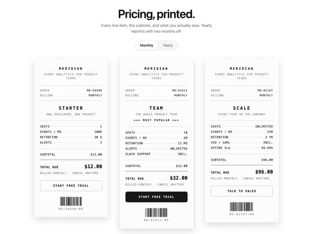
Receipt Pricing
147
Import Patchbay
121
Lookout
82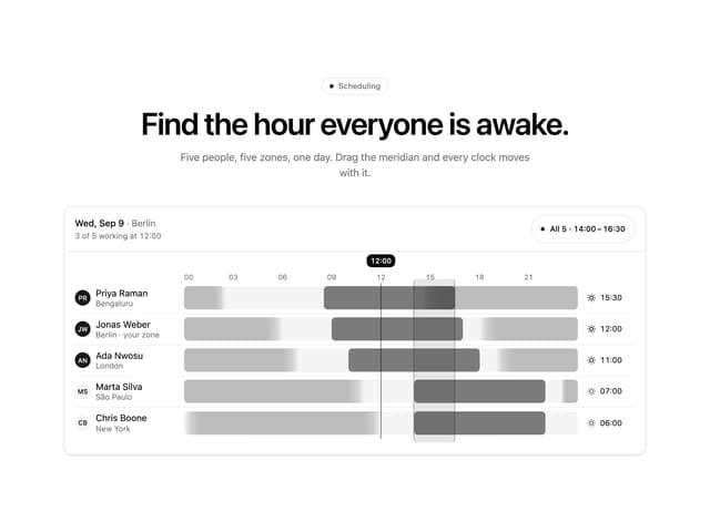
Meridian Rail
2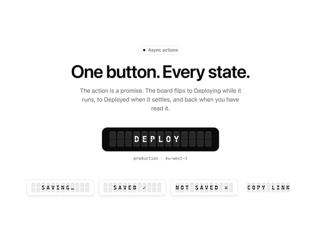
Split Flap Button
1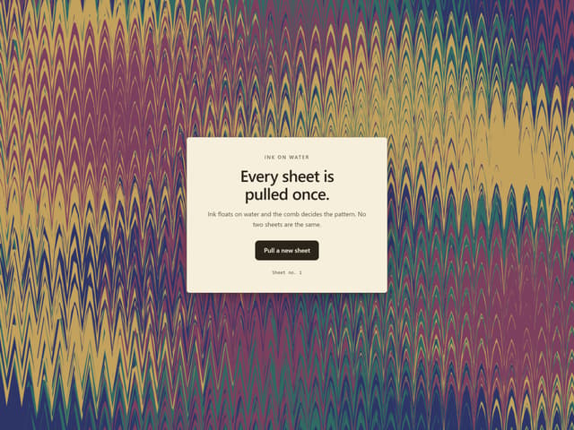
Ink Marbling
More in Heroes
View all

SaaS Template
2.4K

Responsive Hero Banner
2K

Hero
1.2K
Centered Hero with Image Fan
919

HeroSectionWithGradient
334
Editorial Collage Hero
422

Hero 03
313
Glass Fold
193
