
About
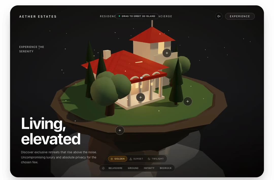
Ultra-luxury architectural real-estate 3D hero header featuring photorealistic floating island Italian villa in Three.js WebGL, interactive spatial hotspots with +/- morphing, 3D drag-to-orbit, and cinematic landmark focus.
Built with React and Tailwind. Copy the prompt and paste it into Claude Code, Cursor or Lovable: your agent adds Real Estate 3D Hero to your project and fits it to your theme.
Code
How Real Estate 3D Hero is used: the demo's code. The component's own source comes with a free account.
Usage.tsx
"use client"

import * as React from "react"
import {
  RealEstate3DHero,
  type RealEstateTheme,
} from "@/components/ui/real-estate-3d-hero"

export default function RealEstate3DDemo() {
  const [activeTheme, setActiveTheme] = React.useState<RealEstateTheme>("stone")

  return (
    <div className="relative min-h-screen w-full bg-background text-foreground p-3 sm:p-6 lg:p-8 flex flex-col items-center justify-center antialiased transition-colors duration-300">
      {/* 3D Real Estate Hero Component */}
      <RealEstate3DHero
        theme={activeTheme}
        brand={{
          name: "AETHER ESTATES",
          href: "#",
        }}
        navItems={[
          { label: "RESIDENCES", href: "#residences" },
          { label: "VISION", href: "#vision" },
          { label: "CONCIERGE", href: "#concierge" },
        ]}
        navCta={{
          label: "EXPERIENCE",
          onClick: () => console.log("Experience CTA clicked"),
        }}
        eyebrow="EXPERIENCE THE SERENITY"
        title={
          <>
            Living,
            <br />
            elevated
          </>
        }
        description="Discover exclusive retreats that rise above the noise. Uncompromising luxury and absolute privacy for the chosen few."
        allowOrbit={true}
        autoRotate={true}
      />

      {/* 21st.dev Reviewer Palette Customizer Bar */}
      <div className="mt-6 flex flex-wrap items-center justify-center gap-2 rounded-2xl border border-border bg-card/80 text-card-foreground p-2 backdrop-blur-md shadow-sm">
        <span className="px-2 text-xs font-semibold uppercase tracking-wider text-muted-foreground">
          Palette:
        </span>
        <button
          type="button"
          onClick={() => setActiveTheme("stone")}
          className={`rounded-xl px-3 py-1.5 text-xs font-medium transition-colors cursor-pointer ${
            activeTheme === "stone"
              ? "bg-primary text-primary-foreground font-semibold shadow-sm"
              : "text-muted-foreground hover:text-foreground hover:bg-muted"
          }`}
        >
          Stone Atmosphere (Original)
        </button>
        <button
          type="button"
          onClick={() => setActiveTheme("twilight")}
          className={`rounded-xl px-3 py-1.5 text-xs font-medium transition-colors cursor-pointer ${
            activeTheme === "twilight"
              ? "bg-cyan-500 text-slate-950 font-semibold shadow-sm"
              : "text-muted-foreground hover:text-foreground hover:bg-muted"
          }`}
        >
          Twilight Sapphire
        </button>
        <button
          type="button"
          onClick={() => setActiveTheme("emerald")}
          className={`rounded-xl px-3 py-1.5 text-xs font-medium transition-colors cursor-pointer ${
            activeTheme === "emerald"
              ? "bg-emerald-500 text-slate-950 font-semibold shadow-sm"
              : "text-muted-foreground hover:text-foreground hover:bg-muted"
          }`}
        >
          Nordic Emerald
        </button>
        <button
          type="button"
          onClick={() => setActiveTheme("amber")}
          className={`rounded-xl px-3 py-1.5 text-xs font-medium transition-colors cursor-pointer ${
            activeTheme === "amber"
              ? "bg-amber-500 text-slate-950 font-semibold shadow-sm"
              : "text-muted-foreground hover:text-foreground hover:bg-muted"
          }`}
        >
          Tuscan Sunset
        </button>
      </div>
    </div>
  )
}
Dependencies
More by WRAPCODERS
View all

Metric Trend Chart
31
Interactive 3D Hero Header
2
Admin Dashboard Cards
More in Heroes
View all

SaaS Template
2.7K

Responsive Hero Banner
2.2K
Editorial Collage Hero
504
Centered Hero with Image Fan
1.1K

Hero
1.3K

Aero Hero-3
617

Hero 03
375
Hero with group of images, text and two buttons
442
