
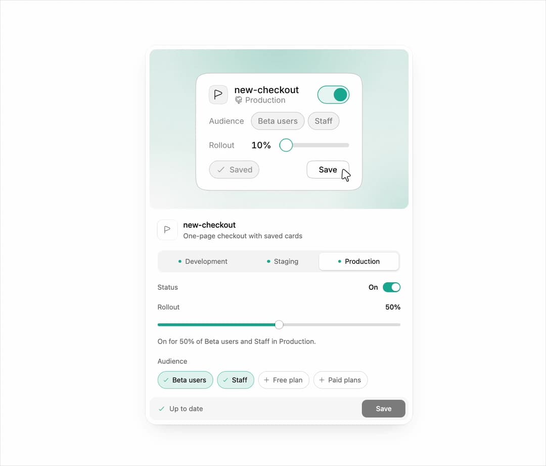
About
Feature flag card with environments, an on switch, a rollout slider, audience chips and a save state, led by an animated Interface illustration from Illos. Light and dark with your theme tokens. Code is MIT; the illustration is under the Illos free license (illos.dev/license).
Built with React and Tailwind. Copy the prompt and paste it into Claude Code, Cursor or Lovable: your agent adds Illos Feature Flag Card to your project and fits it to your theme.
Code
How Illos Feature Flag Card is used: the demo's code. The component's own source comes with a free account.
Usage.tsx
import { IllosFeatureFlagCard } from "@/components/ui/illos-feature-flag-card";

export default function Demo() {
  return (
    <div className="flex min-h-[820px] w-full items-center justify-center bg-background px-4 py-10 sm:px-8">
      <IllosFeatureFlagCard />
    </div>
  );
}
More by Naved
View all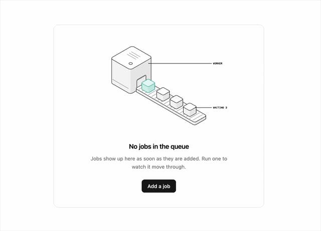

Illos Queue Empty State
58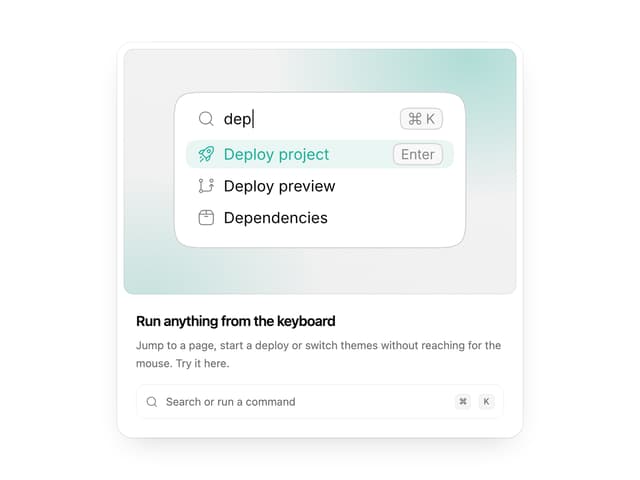
Illos Command Palette
35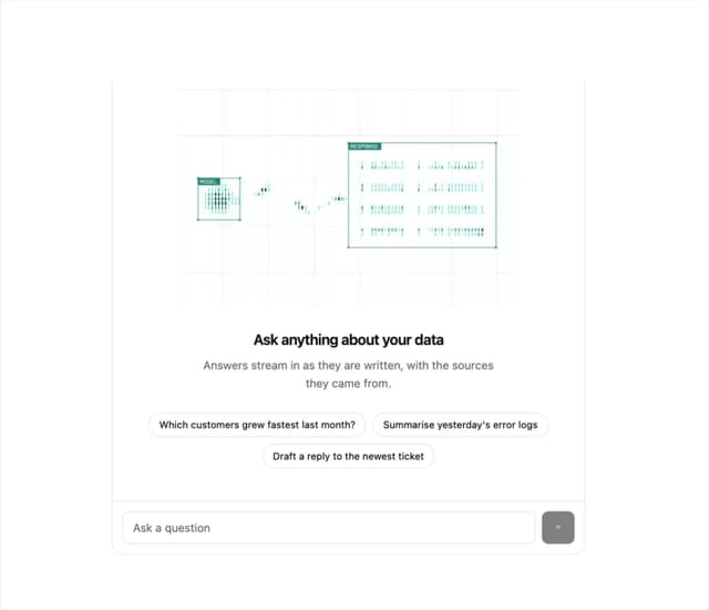
Illos AI Chat Empty State
26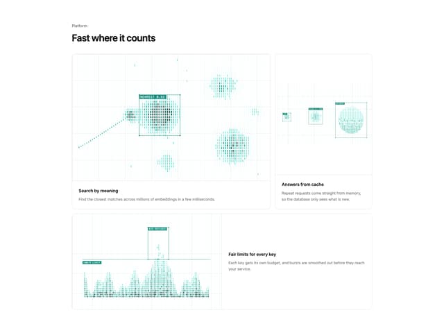
Illos Shader Feature Bento
23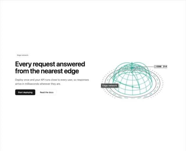
Illos Edge Hero
20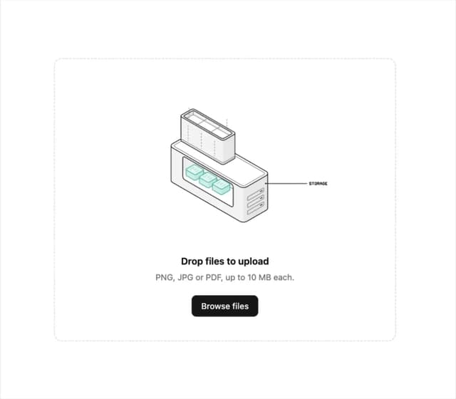
Illos Upload Dropzone
15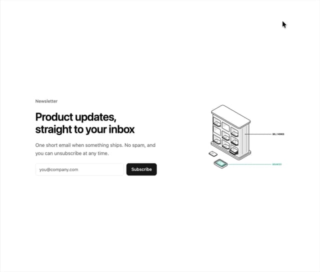
Illos Email Signup
13
Illos Knowledge Sources
12