
About
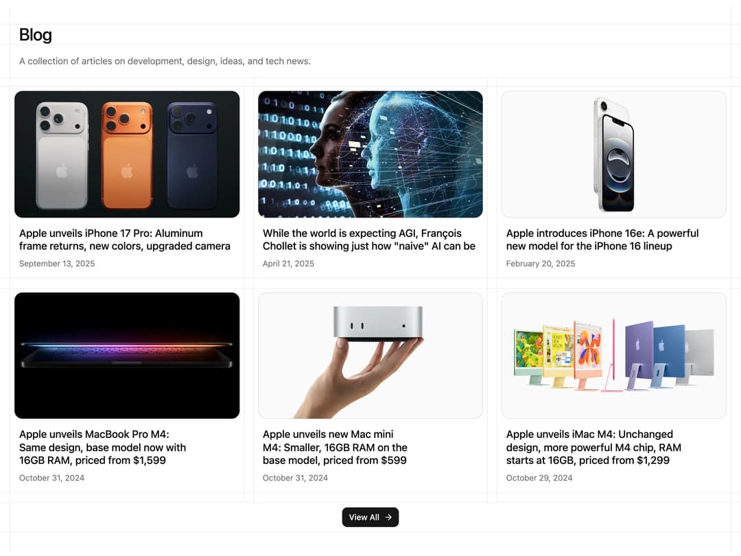
A blog listing section that shows a grid of article cards with cover image, title and publish date inside a lined border grid, plus a view-all button.
Built with React and Tailwind. Copy the prompt and paste it into Claude Code, Cursor or Lovable: your agent adds Blog Section with Lined Grid to your project and fits it to your theme.
Code
How Blog Section with Lined Grid is used: the demo's code. The component's own source comes with a free account.
Usage.tsx
import Blog02 from "@/components/ui/blog-02";

export default function Blog02Demo() {
  return <Blog02 />;
}
Dependencies
More by Chánh Đại
View all
Apple Hello Effect
651
Theme Switcher
305
Hero Golden Spiral
106
Mobius Loop Icon
78
Wheel Picker
73
Glow Card Grid
38
Testimonial 2
37
Spinning Circular Text
24
More in Cards
View all

Course Design Cards
1.3K
Stats cards with links
133

Card
58

Card Studio
14

Interactive Tech Stack Bento Grid with Hover Effects
553
Statistics Card 7
320
The Item one
3
Statistics Card 10
289
