
About
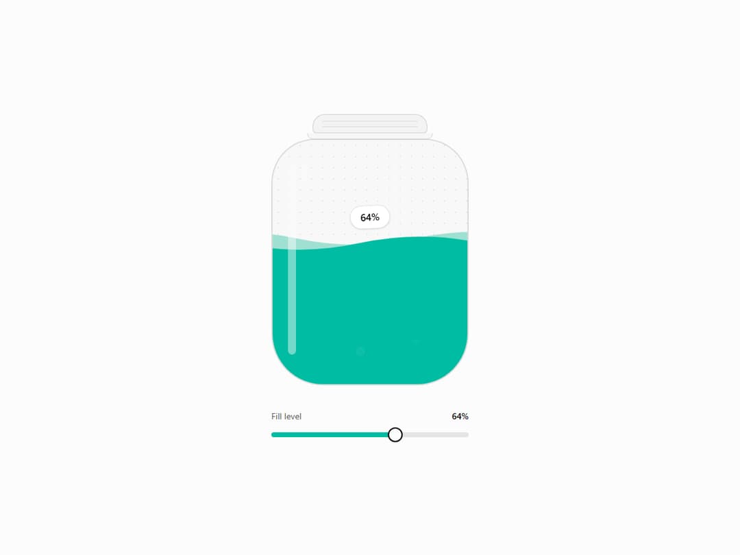
Glass jar filled with animated liquid driven by a value. Spring-physics level, surface that sloshes on change, rising bubbles and a tag riding the surface. ARIA meter, reduced-motion aware, themed with tokens.
Built with React and Tailwind. Copy the prompt and paste it into Claude Code, Cursor or Lovable: your agent adds Liquid Jar to your project and fits it to your theme.
Code
How Liquid Jar is used: the demo's code. The component's own source comes with a free account.
Usage.tsx
import { useId, useState } from "react";
import LiquidJar from "@/components/ui/liquid-jar";

export default function LiquidJarDemo() {
  const [percent, setPercent] = useState(42);
  const sliderId = useId();

  return (
    <div className="flex min-h-[640px] flex-col items-center justify-center gap-10 bg-background px-6 py-16 text-foreground">
      <LiquidJar value={percent} min={0} max={100} label={`${percent}%`} ariaLabel="Fill level" className="w-60 sm:w-72 lg:w-80" />

      <div className="w-full max-w-60 sm:max-w-72 lg:max-w-80">
        <div className="flex items-baseline justify-between text-sm">
          <label htmlFor={sliderId} className="cursor-pointer text-muted-foreground">
            Fill level
          </label>
          <span className="font-medium tabular-nums">{percent}%</span>
        </div>
        <input
          id={sliderId}
          type="range"
          min={0}
          max={100}
          step={1}
          value={percent}
          aria-valuetext={`${percent}%`}
          onChange={(event) => setPercent(Number(event.target.value))}
          style={{
            background: `linear-gradient(90deg, var(--color-chart-2) ${percent}%, color-mix(in oklab, var(--color-foreground) 10%, transparent) ${percent}%)`,
          }}
          className="mt-4 h-2 w-full cursor-pointer appearance-none rounded-full focus-visible:outline-2 focus-visible:outline-offset-8 focus-visible:outline-ring [&::-moz-range-thumb]:size-5 [&::-moz-range-thumb]:rounded-full [&::-moz-range-thumb]:border-2 [&::-moz-range-thumb]:border-foreground [&::-moz-range-thumb]:bg-background [&::-webkit-slider-thumb]:size-6 [&::-webkit-slider-thumb]:appearance-none [&::-webkit-slider-thumb]:rounded-full [&::-webkit-slider-thumb]:border-2 [&::-webkit-slider-thumb]:border-foreground [&::-webkit-slider-thumb]:bg-background [&::-webkit-slider-thumb]:shadow-sm [&::-webkit-slider-thumb]:transition-transform hover:[&::-webkit-slider-thumb]:scale-110"
        />
      </div>
    </div>
  );
}
Dependencies
More by onepaste
View all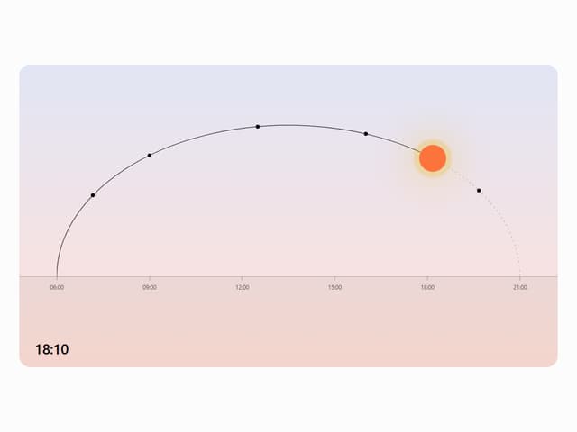

Sun Arc
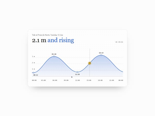
Tide Chart