
About
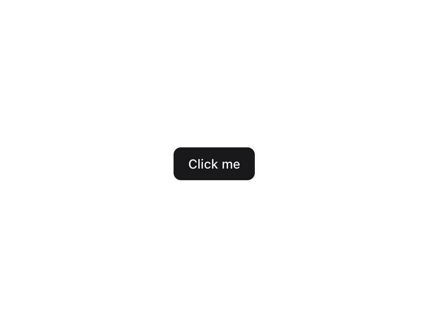
Enhanced shadcn/ui button
Built with React and Tailwind. Copy the prompt and paste it into Claude Code, Cursor or Lovable: your agent adds Button to your project and fits it to your theme.
Code
How Button is used: the demo's code. The component's own source comes with a free account.
Usage.tsx
"use client";

import { Button } from "@/components/ui/button";
import { LoaderCircle } from "lucide-react";
import { useState } from "react";

function Component() {
  const [isLoading, setIsLoading] = useState<boolean>(false);

  const handleClick = () => {
    setIsLoading(true);
    setTimeout(() => {
      setIsLoading(false);
    }, 1000);
  };

  return (
    <Button
      onClick={handleClick}
      disabled={isLoading}
      data-loading={isLoading}
      className="group relative disabled:opacity-100"
    >
      <span className="group-data-[loading=true]:text-transparent">Click me</span>
      {isLoading && (
        <div className="absolute inset-0 flex items-center justify-center">
          <LoaderCircle className="animate-spin" size={16} strokeWidth={2} aria-hidden="true" />
        </div>
      )}
    </Button>
  );
}

export { Component };
Dependencies
More by Origin UI
View all
Dialog
1.3K
Avatar
1K
useImageUpload
954
usePagination
638
Popover
390
Command
348
Calendar [React Day Picker]
273
Accordion
270
More in Buttons
View all
Button
16
Texture Button
110

Button Group

Button
137

Button
37

Eclipse Button
44

Astryx Chat Send Button
3

Random Letter Swap CTA Buttons
62

