
About
Enhanced shadcn/ui select
Built with React and Tailwind. Copy the prompt and paste it into Claude Code, Cursor or Lovable: your agent adds Select to your project and fits it to your theme.
Code
How Select is used: the demo's code. The component's own source comes with a free account.
Usage.tsx
import { Label } from "@/components/ui/label";
import {
  Select,
  SelectContent,
  SelectItem,
  SelectTrigger,
  SelectValue,
} from "@/components/ui/select";
import { RiGatsbyLine, RiNextjsLine, RiReactjsLine } from "@remixicon/react";
import { useId } from "react";

function Component() {
  const id = useId();
  return (
    <div className="space-y-2 min-w-[300px]">
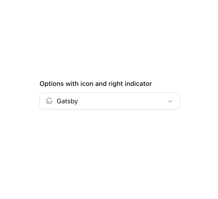
      <Label htmlFor={id}>Options with icon and right indicator</Label>
      <Select defaultValue="2">
        <SelectTrigger
          id={id}
          className="[&>span]:flex [&>span]:items-center [&>span]:gap-2 [&>span_svg]:shrink-0 [&>span_svg]:text-muted-foreground/80"
        >
          <SelectValue placeholder="Select framework" />
        </SelectTrigger>
        <SelectContent className="[&_*[role=option]>span>svg]:shrink-0 [&_*[role=option]>span>svg]:text-muted-foreground/80 [&_*[role=option]>span]:end-2 [&_*[role=option]>span]:start-auto [&_*[role=option]>span]:flex [&_*[role=option]>span]:items-center [&_*[role=option]>span]:gap-2 [&_*[role=option]]:pe-8 [&_*[role=option]]:ps-2">
          <SelectItem value="1">
            <RiReactjsLine size={16} aria-hidden="true" />
            <span className="truncate">React</span>
          </SelectItem>
          <SelectItem value="2">
            <RiNextjsLine size={16} aria-hidden="true" />
            <span className="truncate">Next.js</span>
          </SelectItem>
          <SelectItem value="3">
            <RiGatsbyLine size={16} aria-hidden="true" />
            <span className="truncate">Gatsby</span>
          </SelectItem>
        </SelectContent>
      </Select>
    </div>
  );
}

export { Component };
Dependencies
More by Origin UI
View all
Dialog
1.2K
Avatar
984
useImageUpload
937
usePagination
631
Popover
386
Button
369
Command
335
Calendar [React Day Picker]
267
More in Forms
View all

Premium Auth
532

Contact Card
1K

Book A Demo 1
77

Login 2
8

Card Studio
43
Login Card
29

Form
17

Split Sign In Form
76
