
About
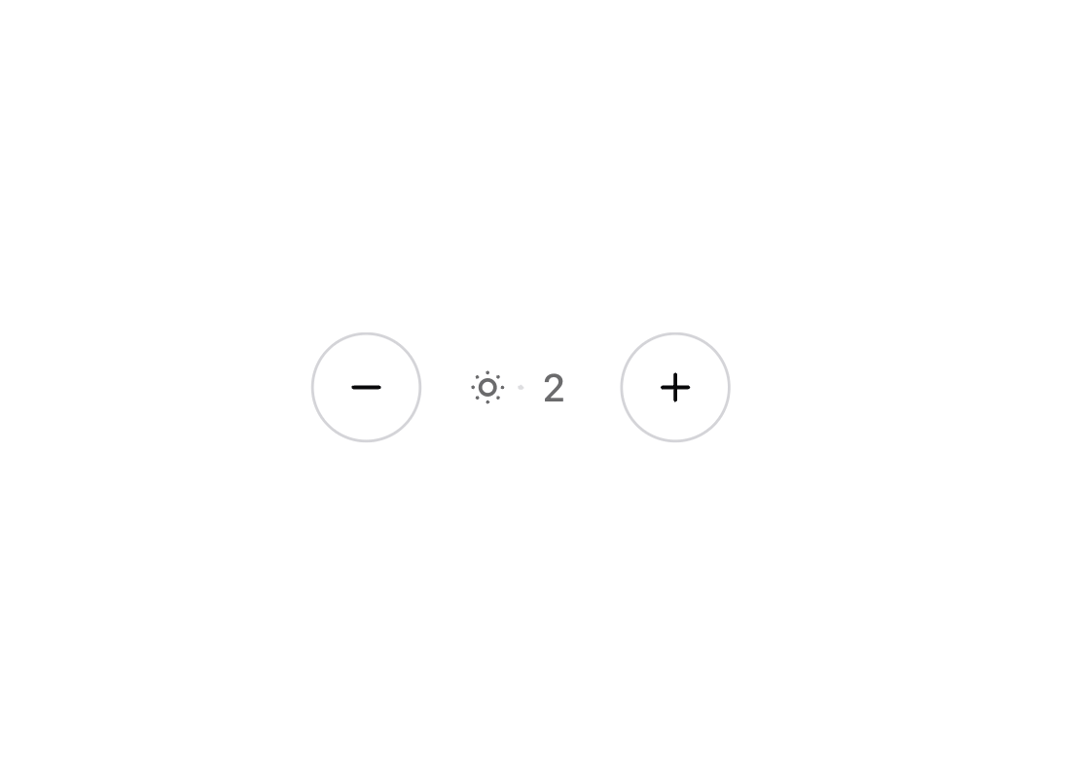
An interactive brightness control component with animated transitions, providing a user-friendly interface for adjusting brightness levels from 0-6.
Built with React and Tailwind. Copy the prompt and paste it into Claude Code, Cursor or Lovable: your agent adds Brightness Control to your project and fits it to your theme.
Code
How Brightness Control is used: the demo's code. The component's own source comes with a free account.
Usage.tsx
import { BrightnessControl } from "@/components/ui/brightness-control";

export function BrightnessControlDemo() {
  return  <BrightnessControl />
}
Dependencies
More by Ozan
View all

Get Started Button
1.1K
Bookmark Icon Button
500
Back Button
326
Avatar Group with Tooltip
78
Heart Button
37
More in Buttons
View all
Button
12

Notification Button
115
Texture Button
105

HeroUI Button Group
2
Button
78
Split Button
16

App Store Button
483

Base Button
1


