
About
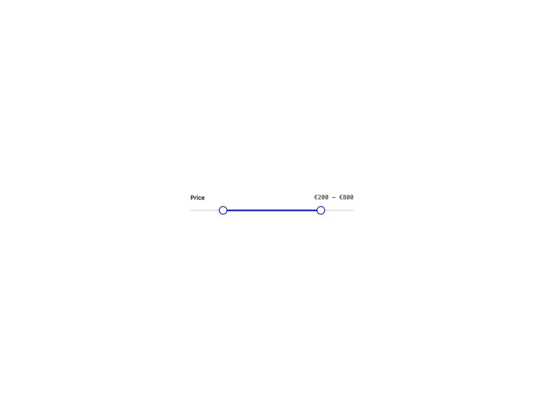
An accessible slider for picking a single number or a min/max range on a track, with keyboard, drag and screen-reader support.
Built with React and Tailwind. Copy the prompt and paste it into Claude Code, Cursor or Lovable: your agent adds Slider to your project and fits it to your theme.
Code
How Slider is used: the demo's code. The component's own source comes with a free account.
Usage.tsx
"use client";

import Slider from "@/components/ui/slider";

export default function RangeSliderDemo() {
  return (
    <div className="flex min-h-[200px] w-full items-center justify-center bg-background p-8 text-foreground">
      <div className="w-full max-w-sm">
        <Slider
          label="Price"
          defaultValue={[200, 800]}
          min={0}
          max={1000}
          step={10}
          formatOptions={{
            style: "currency",
            currency: "EUR",
            maximumFractionDigits: 0,
          }}
        />
      </div>
    </div>
  );
}
Dependencies
More by pearpages
View all
Popover
4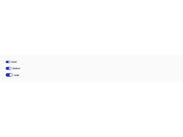
Switch
More in Pricing
View all
Pricing Section
634

Pricing Card
551

Pricing Section
188
Single Pricing Card
806

Pricing Cards
22

RuixenPricing05
110

Boxly Pricing-1
91
Login Card
5

