
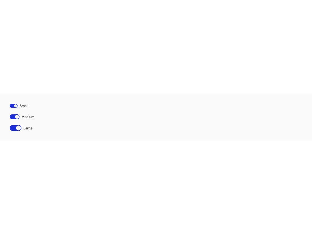
About
An on/off toggle control styled as a switch, with label, description and error text, for settings that take effect immediately.
Built with React and Tailwind. Copy the prompt and paste it into Claude Code, Cursor or Lovable: your agent adds Switch to your project and fits it to your theme.
Code
How Switch is used: the demo's code. The component's own source comes with a free account.
Usage.tsx
import { Switch } from "@/components/ui/switch";

export default function SwitchSizesDemo() {
  return (
    <div
      className="flex w-full h-full flex-col gap-6 p-10"
      style={{
        background: "var(--color-surface-base)",
        color: "var(--color-text-default)",
      }}
    >
      <Switch size="sm" label="Small" defaultChecked />
      <Switch size="md" label="Medium" defaultChecked />
      <Switch size="lg" label="Large" defaultChecked />
    </div>
  );
}
More by pearpages
View all
Popover
4
Slider
More in Forms
View all

Premium Auth
534

Contact Card
1K

Form
17
Login Card
6

Login 1
55
Text Field


Book A Demo 1
78

Split Sign In Form
78

