
About
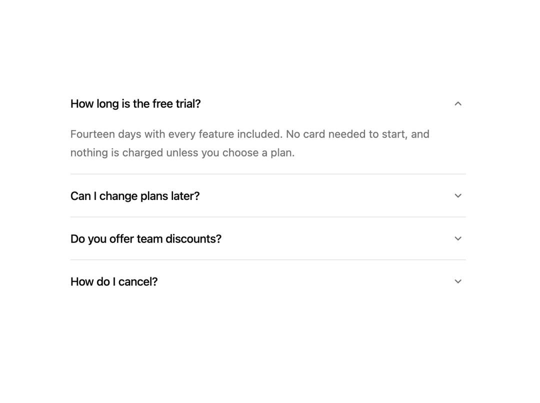
Sections that ease open to their height while the content fades up behind, one at a time or several, with full keyboard support. Free component from uibrik (uibrik.com).
Built with React and Tailwind. Copy the prompt and paste it into Claude Code, Cursor or Lovable: your agent adds Accordion to your project and fits it to your theme.
Code
How Accordion is used: the demo's code. The component's own source comes with a free account.
Usage.tsx
"use client";

import { Accordion } from "@/components/ui/accordion";

const ITEMS = [
  { title: "How long is the free trial?", content: "Fourteen days with every feature included. No card needed to start, and nothing is charged unless you choose a plan." },
  { title: "Can I change plans later?", content: "Yes, at any time. Upgrades apply straight away; downgrades take effect at the end of the current billing period." },
  { title: "Do you offer team discounts?", content: "Teams of ten or more get a lower per-seat price. It applies automatically as you add people." },
  { title: "How do I cancel?", content: "From billing settings, in two clicks. Your workspace stays readable for thirty days afterwards." },
];

const props = {
  type: "single" as "single" | "multiple",
  variant: "divided" as "divided" | "separated",
  icon: "chevron" as "chevron" | "plus",
};

export default function Demo() {
  return (
    <div className="flex h-screen w-full items-center justify-center px-4">
      <Accordion key={props.type} {...props} items={ITEMS} defaultOpen={[0]} className="max-w-lg" />
    </div>
  );
}
Dependencies
More by Malay Patel
View all
Halftone Horizon
52
Halftone
46
Fold Toolbar
31
Balloon Button
31
Ascii Field
12
Oil Slick
11
Hold To Confirm
5
Copy Button
4