
About
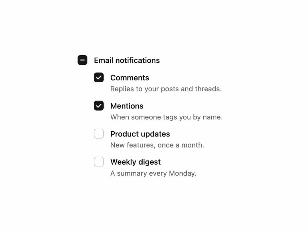
A checkbox and checkbox group whose check draws itself on, morphs into a dash for a partly ticked select-all, and supports shift-click to tick a whole range at once. Free component from uibrik (uibrik.com).
Built with React and Tailwind. Copy the prompt and paste it into Claude Code, Cursor or Lovable: your agent adds Checkbox to your project and fits it to your theme.
Code
How Checkbox is used: the demo's code. The component's own source comes with a free account.
Usage.tsx
"use client";

import { CheckboxGroup } from "@/components/ui/checkbox";

const OPTIONS = [
  { value: "comments", label: "Comments", description: "Replies to your posts and threads." },
  { value: "mentions", label: "Mentions", description: "When someone tags you by name." },
  { value: "updates", label: "Product updates", description: "New features, once a month." },
  { value: "digest", label: "Weekly digest", description: "A summary every Monday." },
];

const { parent, descriptions, ...props } = {
  size: "md" as "sm" | "md" | "lg",
  rangeSelect: true,
  duration: 0.25,
  disabled: false,
  parent: true,
  descriptions: true,
};

export default function Demo() {
  const options = descriptions ? OPTIONS : OPTIONS.map((o) => ({ value: o.value, label: o.label }));
  return (
    <div className="flex h-screen w-full items-center justify-center px-4">
      <CheckboxGroup {...props} options={options} defaultValue={["comments", "mentions"]} selectAll={parent ? "Email notifications" : undefined} label="Email notifications" />
    </div>
  );
}
Dependencies
More by Malay Patel
View all
Halftone Horizon
52
Halftone
46
Fold Toolbar
31
Balloon Button
31
Ascii Field
12
Oil Slick
11
Hold To Confirm
5
Copy Button
4