
About
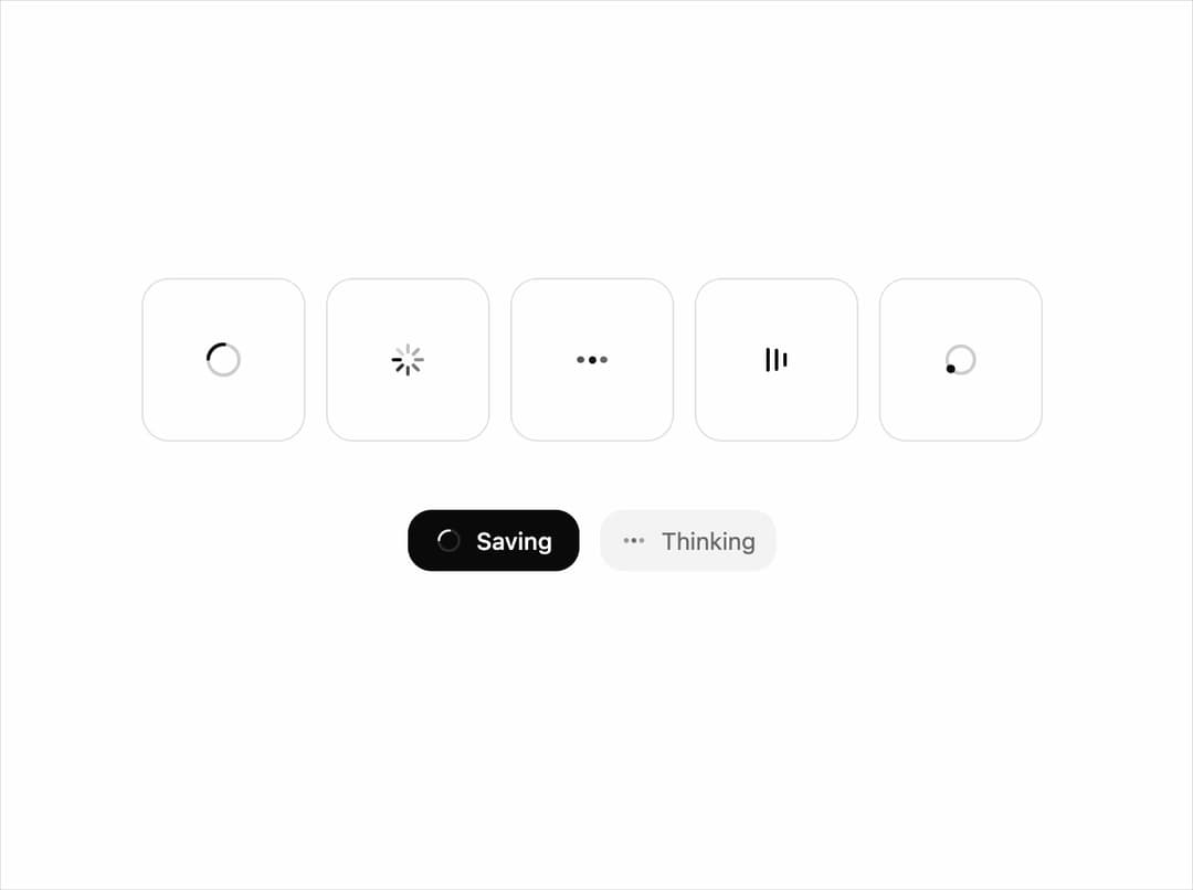
A small family of loading indicators (ring, radial, dots, bars, orbit) drawn on one grid with one stroke and tempo. Free component from uibrik (uibrik.com).
Built with React and Tailwind. Copy the prompt and paste it into Claude Code, Cursor or Lovable: your agent adds Spinner to your project and fits it to your theme.
Code
How Spinner is used: the demo's code. The component's own source comes with a free account.
Usage.tsx
"use client";

import { Spinner, type SpinnerVariant } from "@/components/ui/spinner";

const VARIANTS: SpinnerVariant[] = ["ring", "radial", "dots", "bars", "orbit"];

const props = {
  size: 24,
  thickness: 2,
  speed: 1,
};

export default function Demo() {
  return (
    <div className="flex h-screen w-full flex-col items-center justify-center gap-10 px-4">
      <div className="flex flex-wrap items-center justify-center gap-3">
        {VARIANTS.map((v) => (
          <div key={v} className="grid size-24 place-items-center rounded-2xl bg-background text-foreground shadow-[inset_0_0_0_1px_var(--border)]">
            <Spinner {...props} variant={v} />
          </div>
        ))}
      </div>
      {/* The same family at work: inside a button, in muted text. */}
      <div className="flex items-center gap-3">
        <button className="flex h-9 items-center gap-2 rounded-xl bg-foreground px-4 text-sm font-medium text-background" disabled>
          <Spinner size={16} variant="ring" speed={props.speed} />
          Saving
        </button>
        <span className="flex h-9 items-center gap-2 rounded-xl bg-muted px-3 text-sm text-muted-foreground">
          <Spinner size={16} variant="dots" speed={props.speed} />
          Thinking
        </span>
      </div>
    </div>
  );
}
Dependencies
More by Malay Patel
View all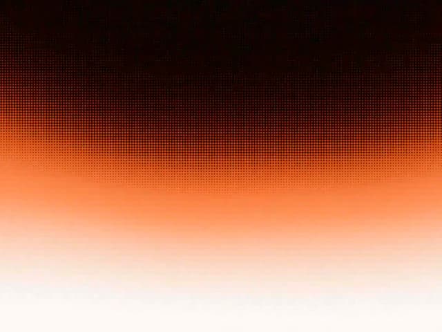
Halftone Horizon
52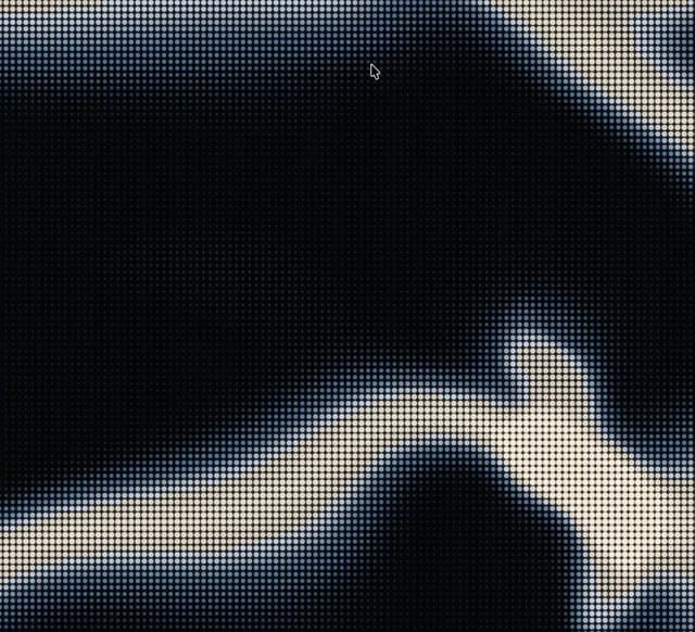
Halftone
46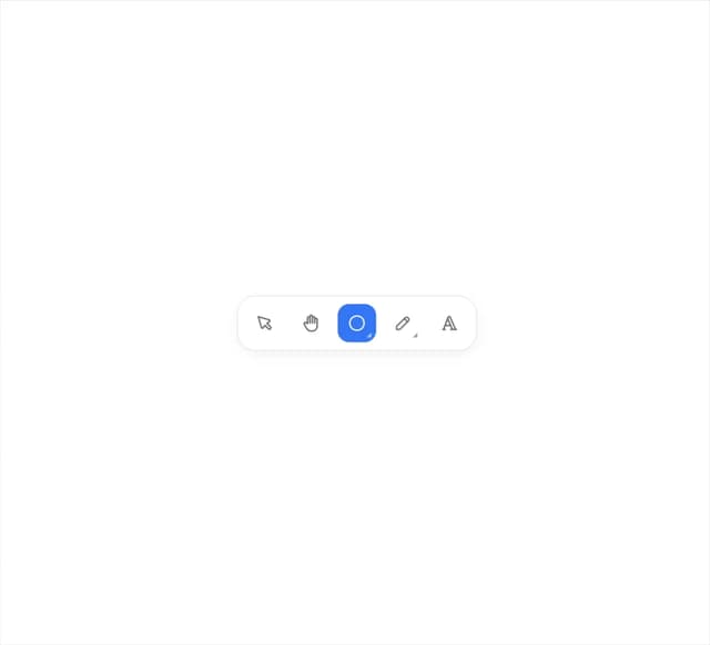
Fold Toolbar
31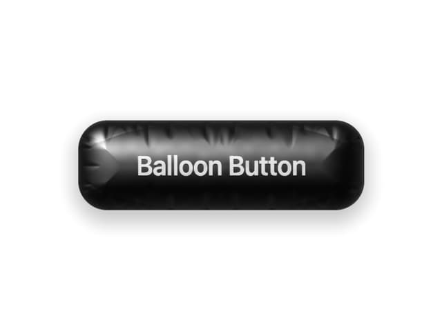
Balloon Button
31
Ascii Field
12
Oil Slick
11
Hold To Confirm
5
Copy Button
4