
About
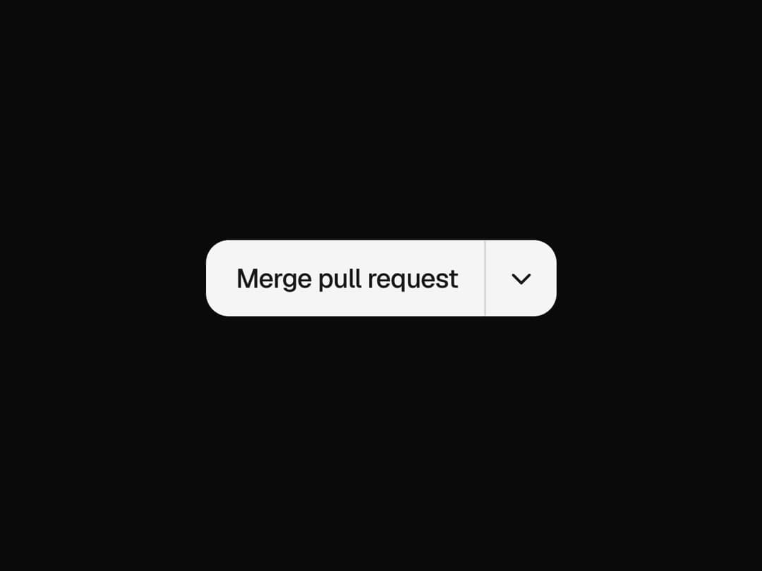
A primary button with a menu of alternative actions; the chosen one rolls into the main label. Free component from uibrik (uibrik.com).
Built with React and Tailwind. Copy the prompt and paste it into Claude Code, Cursor or Lovable: your agent adds Split Button to your project and fits it to your theme.
Code
How Split Button is used: the demo's code. The component's own source comes with a free account.
Usage.tsx
"use client";

import { SplitButton } from "@/components/ui/split-button";

const props = {
  options: ["Merge pull request", "Squash and merge", "Rebase and merge"] as string[],
  variant: "solid" as "solid" | "soft" | "outline",
  size: "md" as "sm" | "md" | "lg",
  align: "end" as "end" | "start",
  side: "bottom" as "bottom" | "top",
  radius: 12,
  stagger: 0.03,
};

export default function Demo() {
  return (
    // Offset from centre toward the side away from the menu, so it has room to open.
    <div
      className="flex h-screen w-full items-start justify-center px-4"
      style={{ paddingTop: props.side === "top" ? "58vh" : "30vh" }}
    >
      <SplitButton {...props} />
    </div>
  );
}
Dependencies
More by Malay Patel
View all
Halftone
48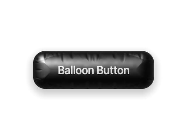
Balloon Button
33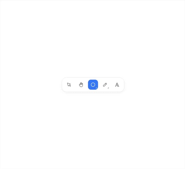
Fold Toolbar
31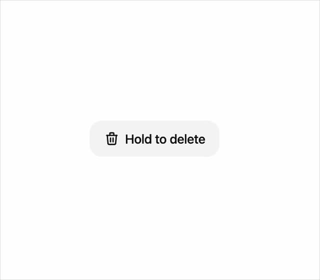
Hold To Confirm
14
Marquee
9
Aurora
6
Copy Button
4
Otp Input
4