
About
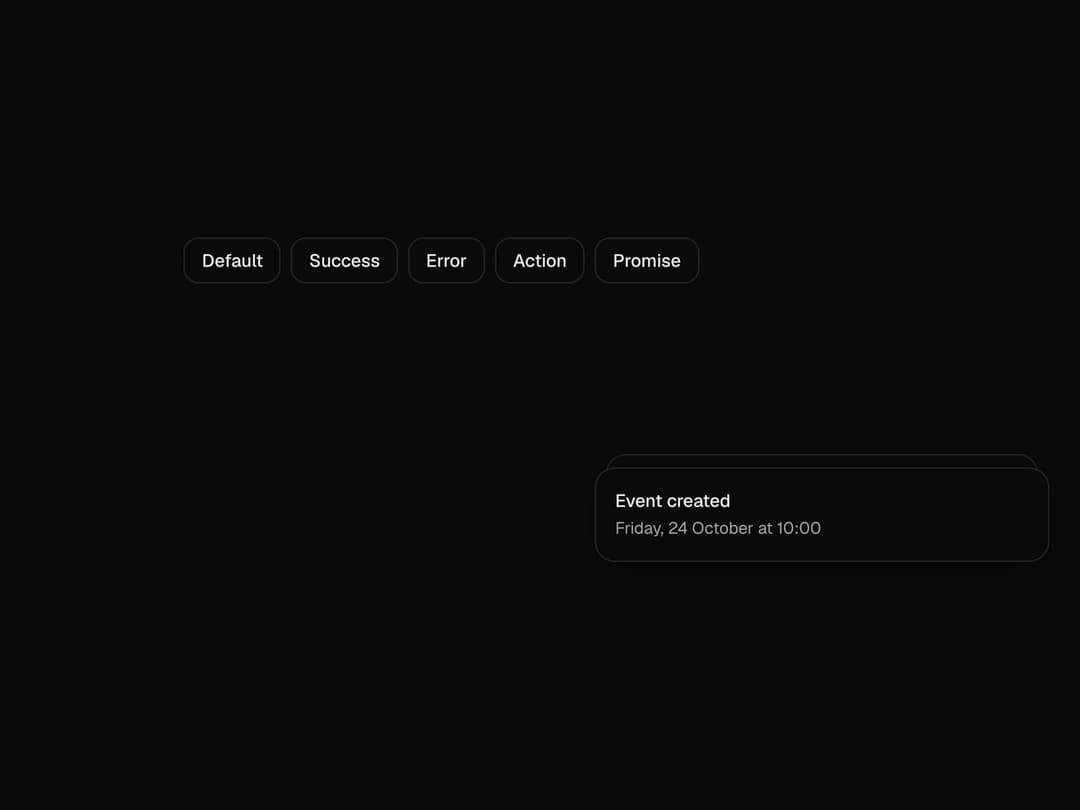
Toasts that stack, fan out on hover, swipe away, and follow a promise from loading to done in one toast. Free component from uibrik (uibrik.com).
Built with React and Tailwind. Copy the prompt and paste it into Claude Code, Cursor or Lovable: your agent adds Toast to your project and fits it to your theme.
Code
How Toast is used: the demo's code. The component's own source comes with a free account.
Usage.tsx
"use client";

import { Toaster, toast } from "@/components/ui/toast";
import { useEffect } from "react";

const wait = (ms: number) => new Promise((r) => setTimeout(r, ms));

const EXAMPLES = [
  { label: "Default", run: () => toast("Event created", { description: "Friday, 24 October at 10:00" }) },
  { label: "Success", run: () => toast.success("Changes saved") },
  { label: "Error", run: () => toast.error("Couldn't reach the server", { description: "Check your connection and try again." }) },
  { label: "Action", run: () => toast("Message archived", { action: { label: "Undo", onClick: () => toast("Message restored") } }) },
  {
    label: "Promise",
    run: () =>
      toast.promise(wait(1800), {
        loading: "Uploading report.pdf",
        success: "Report uploaded",
        error: "Upload failed",
      }),
  },
];

const props = {
  position: "bottom-right" as "top-left" | "top-center" | "top-right" | "bottom-left" | "bottom-center" | "bottom-right",
  expand: false,
  visibleToasts: 3,
  duration: 4000,
  gap: 12,
  closeButton: false,
};

export default function Demo() {
  // A small stack on arrival, so the preview isn't empty.
  useEffect(() => {
    const timers = [
      setTimeout(() => toast.success("Changes saved"), 300),
      setTimeout(() => toast("Event created", { description: "Friday, 24 October at 10:00" }), 700),
    ];
    return () => {
      timers.forEach(clearTimeout);
      toast.dismiss();
    };
  }, []);

  return (
    <div className="flex h-screen w-full items-center justify-center px-4">
      <div className="flex max-w-lg flex-wrap justify-center gap-2">
        {EXAMPLES.map((e) => (
          <button
            key={e.label}
            type="button"
            onClick={e.run}
            className="h-9 cursor-pointer rounded-xl bg-background px-3.5 text-sm font-medium text-foreground shadow-[inset_0_0_0_1px_var(--border)] outline-none transition-colors duration-150 hover:bg-muted focus-visible:ring-2 focus-visible:ring-neutral-400"
          >
            {e.label}
          </button>
        ))}
      </div>
      <Toaster {...props} />
    </div>
  );
}
Dependencies
More by Malay Patel
View all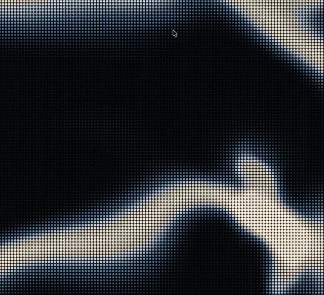
Halftone
48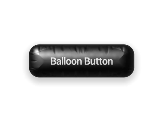
Balloon Button
33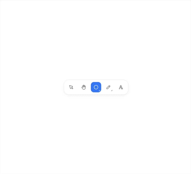
Fold Toolbar
31
Hold To Confirm
14
Marquee
9
Aurora
6
Copy Button
4
Otp Input
4