About
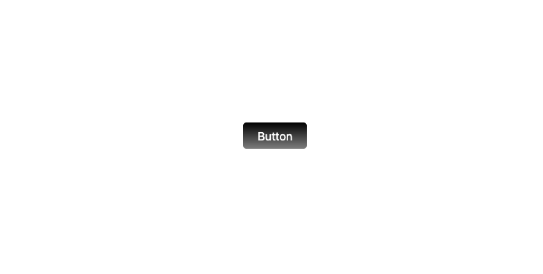
Here is Button Ui components
Built with React and Tailwind. Copy the prompt and paste it into Claude Code, Cursor or Lovable: your agent adds Button Ui to your project and fits it to your theme.
Code
How Button Ui is used: the demo's code. The component's own source comes with a free account.
Usage.tsx
"use client";

import React from "react";


export default function Example() {
    return (
        <div className="relative group overflow-hidden bg-white/20 p-0.5 h-9 w-20 rounded-md active:scale-100 hover:scale-105 transition-all duration-300">
            <button className="text-white text-sm bg-gradient-to-t from-black/50 to-black h-full w-full rounded">
                Button
            </button>
            <div className="absolute -bottom-12 group-hover:-bottom-10 transition-all duration-200 left-1/2 -z-10 -translate-x-1/2 blur size-14 rounded-full bg-white"></div>
        </div>
    );
};More by prebuiltui
View all

Image Gallery
1.4K
Hero Section
446
Feature Sections
375
Testimonial
348
Cards
242
FAQ Sections
191
Form
141
Login Form
138
More in Buttons
View all
Button
16
Texture Button
110

Button Group

Button
137

Button
37

Eclipse Button
44

Astryx Chat Send Button
3

Random Letter Swap CTA Buttons
62

