
About
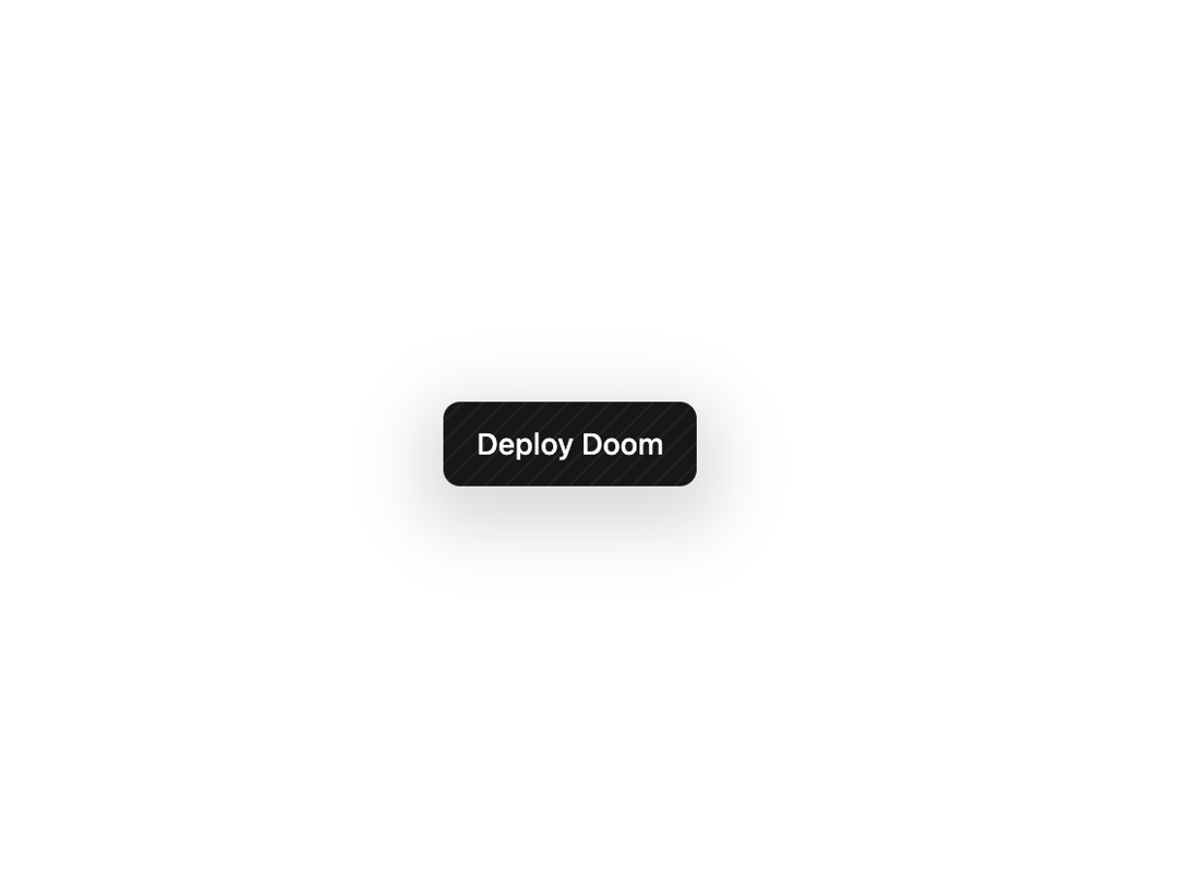
A clean, minimal button built on the shadcn Button with a faint diagonal hatch overlay and a soft drop shadow that adapts to light and dark themes. Understated by design.
Built with React and Tailwind. Copy the prompt and paste it into Claude Code, Cursor or Lovable: your agent adds Minimal Button to your project and fits it to your theme.
Code
How Minimal Button is used: the demo's code. The component's own source comes with a free account.
Usage.tsx
"use client";

import MinimalButton from "@/components/ui/minimal-button";

export default function Default() {
  return (
    <div className="flex min-h-screen w-full items-center justify-center bg-background p-12">
      <MinimalButton>Deploy Doom</MinimalButton>
    </div>
  );
}
Dependencies
More by jay sharma
View all

Live Orb
666
Chrome Button
189
Shader Metal
168
Frame Button
139
ASCII Fluid
90
Highlight Button
86
Brutal Button
75
Logo Burst
70
More in Buttons
View all
Button
12

Notification Button
115
Texture Button
105

HeroUI Button Group
2

App Store Button
482
Split Button
16
Button
78

Base Button
1


