

About
A ticket-style button with rounded corner cut-outs punched into each corner, like a torn cinema pass, with a quick press-scale tactile effect. Theme-aware via primary and background tokens.
Built with React and Tailwind. Copy the prompt and paste it into Claude Code, Cursor or Lovable: your agent adds Movie Pass Button to your project and fits it to your theme.
Code
How Movie Pass Button is used: the demo's code. The component's own source comes with a free account.
Usage.tsx
"use client";

import MoviePassButton from "@/components/ui/movie-pass";

export default function Default() {
  return (
    <div className="flex min-h-screen w-full items-center justify-center bg-background p-12">
      <MoviePassButton>Deploy Doom</MoviePassButton>
    </div>
  );
}
More by jay sharma
View all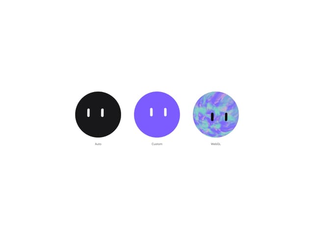

Live Orb
676
Chrome Button
190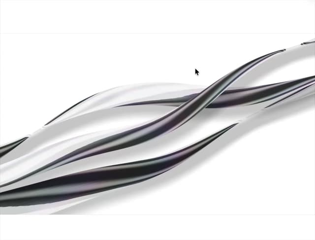
Shader Metal
171
Frame Button
139
ASCII Fluid
92
Highlight Button
88
Brutal Button
76
Logo Burst
72
More in Buttons
View all
Texture Button
107

Notification Button
116
Button
14

HeroUI Button Group
1

Button
2
Base Button
2

App Store Button
484

Button
36

