
About
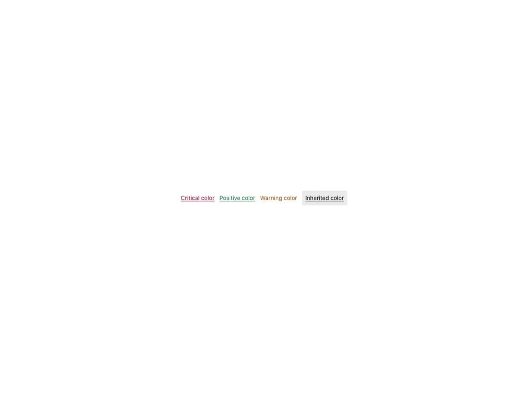
Navigation link for use within text that respects line breaks and text flow. Works with both href and onClick (rendering an anchor or button tag), offers underline and plain variants, primary/positive/critical/warning/inherit colors, a disabled state and an optional icon for standalone usage.
Built with React and Tailwind. Copy the prompt and paste it into Claude Code, Cursor or Lovable: your agent adds Reshaped Link to your project and fits it to your theme.
Code
How Reshaped Link is used: the demo's code. The component's own source comes with a free account.
Usage.tsx
import { Reshaped, View } from "reshaped/bundle";
import Link from "@/components/ui/reshaped-link";

export default function Demo() {
  return (
    <Reshaped theme="slate">
      <div style={{ margin: "0 auto", padding: 24, display: "flex", justifyContent: "center" }}>
        <View gap={3} direction="row" align="center">
          <Link color="critical" href="#">
            Critical color
          </Link>
          <Link color="positive" href="#">
            Positive color
          </Link>
          <Link color="warning" href="#">
            Warning color
          </Link>
          <View padding={2} backgroundColor="neutral" borderRadius="small">
            <Link color="inherit" href="#">
              Inherited color
            </Link>
          </View>
        </View>
      </div>
    </Reshaped>
  );
}
Dependencies
More by reshaped
View all
Reshaped Toast
9
Reshaped Calendar
9
Reshaped Context menu
7
Reshaped Checkbox
7
Reshaped Autocomplete
7
Reshaped Progress indicator
6
Reshaped Pagination
6
Reshaped Carousel
6
More in Buttons
View all

Button
5

App Store Button
453

Button
47

Eclipse Button
39
Texture Button
92

Button
4
Split Button
14

Button
32

