
About
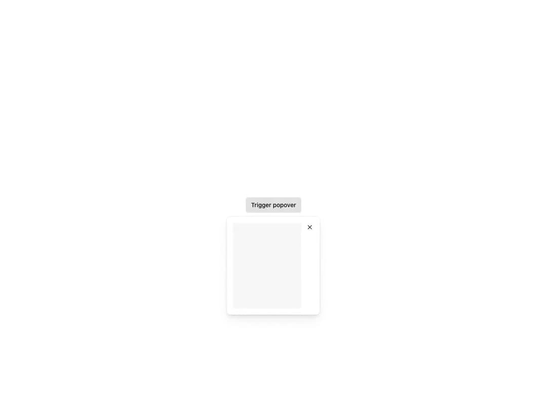
Overlay attached to any interactive trigger element via passed attributes, opening on click or hover. Automatically repositions within the viewport with controllable fallback positions, supports custom content padding, a Dismissible close button, custom or trigger-aligned width, controlled state and focus trapping.
Built with React and Tailwind. Copy the prompt and paste it into Claude Code, Cursor or Lovable: your agent adds Reshaped Popover to your project and fits it to your theme.
Code
How Reshaped Popover is used: the demo's code. The component's own source comes with a free account.
Usage.tsx
import { Button, Reshaped, View } from "reshaped/bundle";
import Popover from "@/components/ui/reshaped-popover";

export default function Demo() {
  return (
    <Reshaped theme="slate">
      <div style={{ margin: "0 auto", padding: 24, display: "flex", justifyContent: "center" }}>
        <Popover>
          <Popover.Trigger>
            {(attributes) => <Button attributes={attributes}>Trigger popover</Button>}
          </Popover.Trigger>
          <Popover.Content>
            <Popover.Dismissible closeAriaLabel="Close popover">
              <View backgroundColor="neutral-faded" height={50} />
            </Popover.Dismissible>
          </Popover.Content>
        </Popover>
      </div>
    </Reshaped>
  );
}
Dependencies
More by reshaped
View all
Reshaped Toast
11
Reshaped Calendar
9
Reshaped Progress indicator
7
Reshaped Context menu
7
Reshaped Checkbox
7
Reshaped Autocomplete
7
Reshaped Slider
6
Reshaped Pagination
6
More in Buttons
View all
Button
10

Button
1

Eclipse Button
42
Native Button
12
Texture Button
102
Split Button
15
Button

Button
76


