
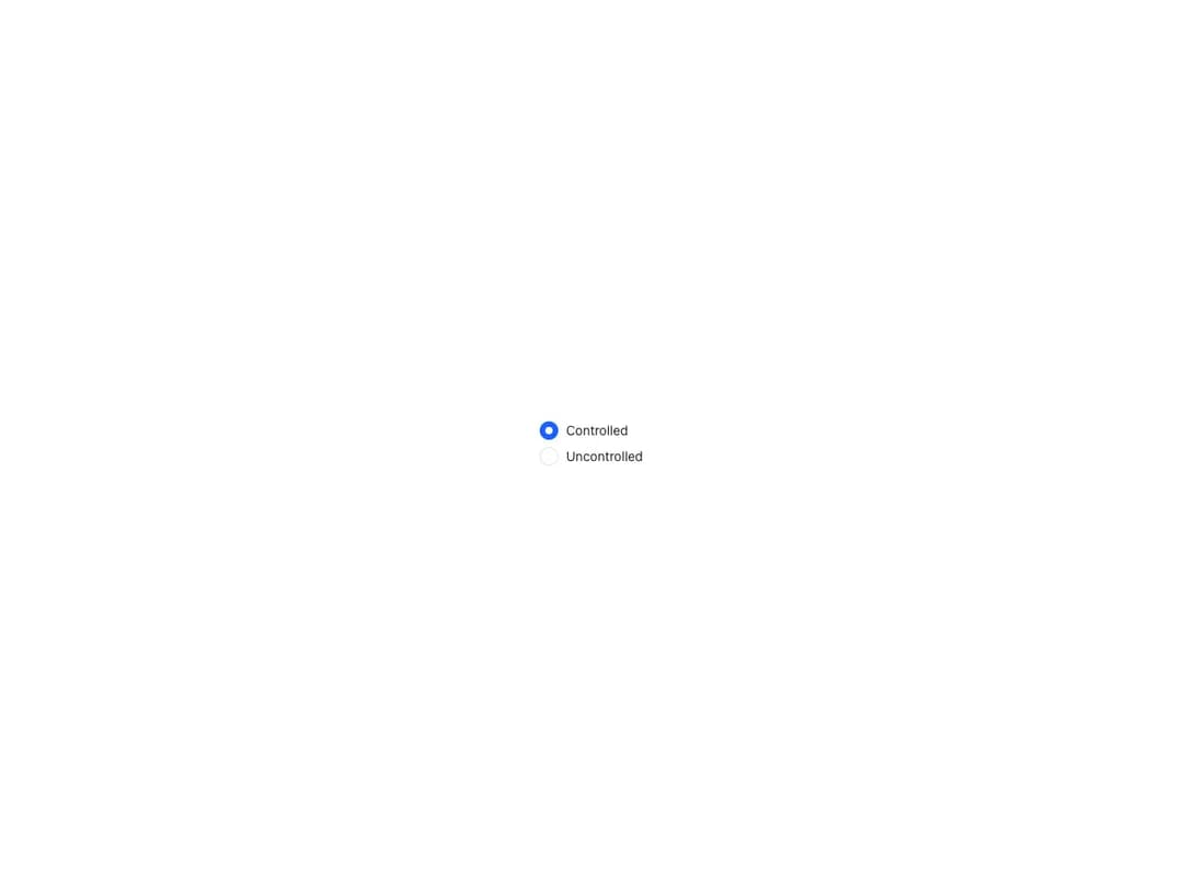
About
Works like a native radio button with value passed to the form on submission, in controlled or uncontrolled mode. Comes in three sizes, supports error and disabled states, and a RadioGroup compound for exclusive selection with any layout, FormControl group labels and card-based composition.
Built with React and Tailwind. Copy the prompt and paste it into Claude Code, Cursor or Lovable: your agent adds Reshaped Radio to your project and fits it to your theme.
Code
How Reshaped Radio is used: the demo's code. The component's own source comes with a free account.
Usage.tsx
import { Reshaped, View } from "reshaped/bundle";
import Radio from "@/components/ui/reshaped-radio";

export default function Demo() {
  return (
    <Reshaped theme="slate">
      <div style={{ margin: "0 auto", padding: 24, display: "flex", justifyContent: "center" }}>
        <View gap={2}>
          <Radio name="animal" value="dog" checked>
            Controlled
          </Radio>
          <Radio name="animal" value="cat" defaultChecked>
            Uncontrolled
          </Radio>
        </View>
      </div>
    </Reshaped>
  );
}
Dependencies
More by reshaped
View all
Reshaped Toast
9
Reshaped Calendar
9
Reshaped Context menu
7
Reshaped Checkbox
7
Reshaped Autocomplete
7
Reshaped Progress indicator
6
Reshaped Pagination
6
Reshaped Carousel
6
More in Forms
View all

Premium Auth
496

Login 2
7
Authentication Card
45

Login 1
52

Form
16

Contact Card
1K

Card Studio
41

Form
136
