
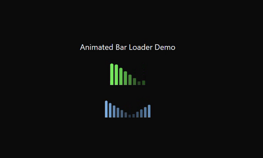
The BarLoader is a sleek, animated loading component for React applications, designed to provide a visually engaging feedback during data fetching or processing. It features multiple vertical bars that scale up and down in a smooth, rhythmic motion, creating a pulsating effect that draws attention without being distracting. Each bar’s height, width, color, number of bars, and animation speed are fully configurable, allowing developers to easily adapt the loader to match their application’s design and theme, including dark and light modes with Tailwind CSS. The animation is implemented using inline CSS keyframes, ensuring lightweight performance without external dependencies. Its minimal yet dynamic design makes it ideal for dashboards, landing pages, and interactive UI elements, providing a professional and modern loading experience.
Built with React and Tailwind. Copy the prompt and paste it into Claude Code, Cursor or Lovable: your agent adds BarLoader to your project and fits it to your theme.
Code
How BarLoader is used: the demo's code. The component's own source comes with a free account.
Usage.tsx
"use client";

import React from "react";
import BarLoader from "@/components/ui/bar-loader";

const BarLoaderDemo: React.FC = () => {
  return (
    <div className="flex flex-col items-center justify-center">
      <h1 className="text-2xl font-medium mb-8 text-gray-800 dark:text-gray-200">
        Animated Bar Loader Demo
      </h1>

      {/* Default Loader */}
      <BarLoader className="mb-10" />

      {/* Customized Loader */}
      <BarLoader
        bars={12}
        barWidth={8}
        barHeight={60}
        color="bg-blue-500 dark:bg-blue-300"
        speed={1.5}
      />
    </div>
  );
};

export default BarLoaderDemo;
More by ruhith
View all
Health Stat Card
166
LoadingLines
152
LoadingRadar
126
LoadingBottle
120
Loader
73
BouncingCirclesLoader
52
LoaderProgressiveBar
50
LoaderGrid
48