
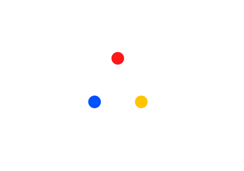
This loader component is a gooey dots animation built with React, TypeScript, Tailwind CSS, and a small amount of custom CSS keyframes. It consists of three colorful circular dots (yellow, blue, and red) that shrink, move, and return in a loop while the entire group rotates smoothly, creating a fluid and dynamic motion. The effect is enhanced by an SVG goo filter (feGaussianBlur + feColorMatrix) that blends the dots together into a single organic shape when they overlap, giving the illusion of liquid merging and separating. The component is fully responsive, centered on the screen with Tailwind utilities, and uses modern CSS animations for performance-friendly rendering. It’s an eye-catching, reusable loader ideal for projects that need a playful, modern loading animation.
Built with React and Tailwind. Copy the prompt and paste it into Claude Code, Cursor or Lovable: your agent adds Loader to your project and fits it to your theme.
Code
How Loader is used: the demo's code. The component's own source comes with a free account.
Usage.tsx
import React from "react";
import Loader from "@/components/ui/loader";

const DemoPage: React.FC = () => {
  return (
    <Loader />
  );
};

export default DemoPage;
More by ruhith
View all
Health Stat Card
148
LoadingLines
147
LoadingRadar
121
LoadingBottle
115
BarLoader
90
BouncingCirclesLoader
50
LoaderProgressiveBar
49
LoaderGrid
44