
About
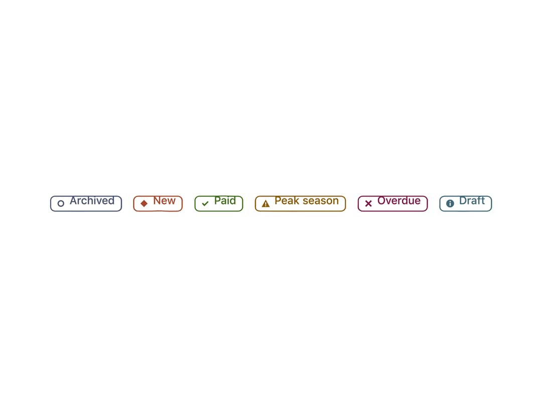
A small inline status label (e.g. "Paid", "Draft", "Saving") that pairs its tone with a distinct shape so colour is never the only signal, with three visual registers: a quiet bordered chip, a warm hand-inked outline, or a playful filled chip with a tiny ornament.
Built with React and Tailwind. Copy the prompt and paste it into Claude Code, Cursor or Lovable: your agent adds Hand-Inked Status Badge to your project and fits it to your theme.
Code
How Hand-Inked Status Badge is used: the demo's code. The component's own source comes with a free account.
Usage.tsx
import Badge from "@/components/ui/badge";

export default function BadgeDemo() {
  return (
    <div className="flex min-h-[240px] w-full flex-wrap items-center justify-center gap-3 p-8">
      <Badge>Archived</Badge>
      <Badge tone="accent">New</Badge>
      <Badge tone="success">Paid</Badge>
      <Badge tone="warning">Peak season</Badge>
      <Badge tone="danger">Overdue</Badge>
      <Badge tone="info">Draft</Badge>
    </div>
  );
}
More by sarat-asymmetrica
View all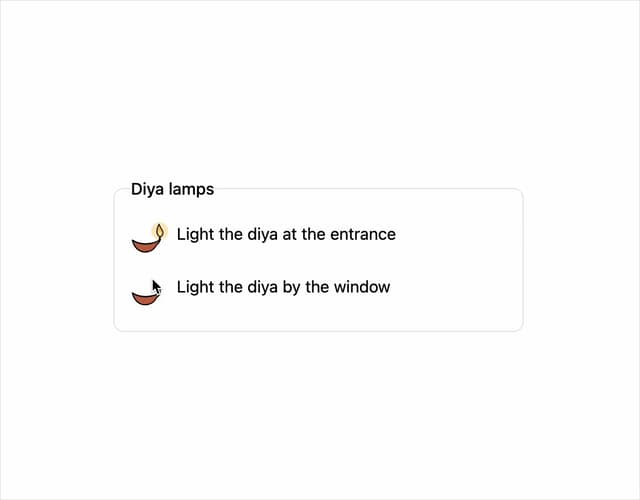
Toggle
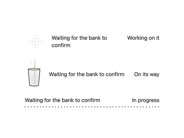
Kolam & Chai Progress
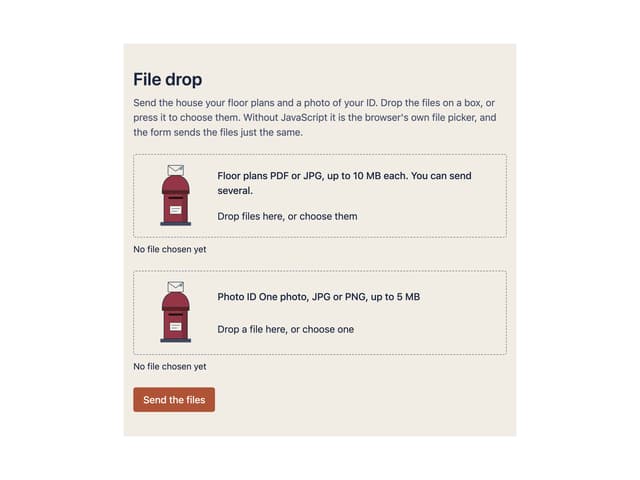
File Drop
Field Note