
About
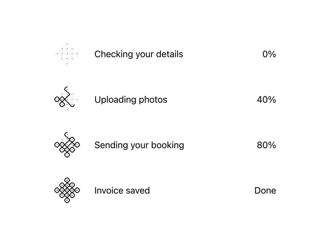
A labeled progress indicator ported from a native-progress-enhancing web component, with three visual registers: a plain pencil-hairline bar, a hand-inked kolam line that closes at 100%, or a cutting-chai glass that fills with tea — moving only when the value moves and speaking its state in words when indeterminate.
Built with React and Tailwind. Copy the prompt and paste it into Claude Code, Cursor or Lovable: your agent adds Kolam & Chai Progress to your project and fits it to your theme.
Code
How Kolam & Chai Progress is used: the demo's code. The component's own source comes with a free account.
Usage.tsx
"use client";
import Progress from "@/components/ui/progress";

export default function ProgressValuesDemo() {
  return (
    <div className="w-full max-w-md mx-auto grid gap-4 p-6 bg-background text-foreground">
      <Progress label="Checking your details" value={0} max={1} />
      <Progress label="Uploading photos" value={0.4} max={1} />
      <Progress label="Sending your booking" value={0.8} max={1} />
      <Progress label="Invoice saved" value={1} max={1} />
    </div>
  );
}
More by sarat-asymmetrica
View all
Toggle
Hand-Inked Status Badge
File Drop
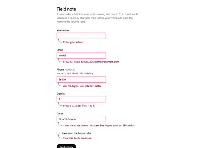
Field Note