About
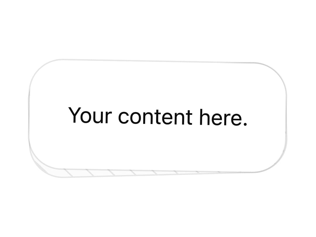
A stacked card that reveals a striped back card behind it on hover, useful for feature highlights or product cards with a playful lean effect.
Built with React and Tailwind. Copy the prompt and paste it into Claude Code, Cursor or Lovable: your agent adds Lean Card to your project and fits it to your theme.
Code
How Lean Card is used: the demo's code. The component's own source comes with a free account.
Usage.tsx
import { LeanCard, LeanCardContent } from "@/components/ui/lean-card";

export default function LeanCardDemo() {
  return (
    <div className="flex items-center justify-center w-full min-h-[400px]">
      <LeanCard>
        <LeanCardContent>
          <p>Your content here.</p>
        </LeanCardContent>
      </LeanCard>
    </div>
  );
}
More by scrollxui
View all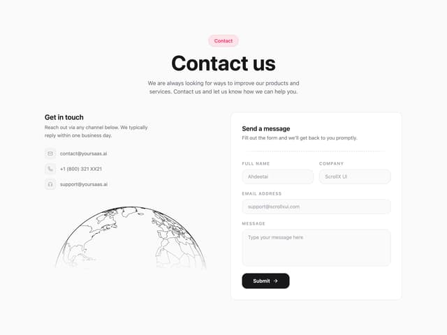

Contact with Globe
396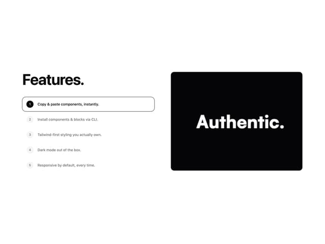
Features With Panel
376
Hero Section with Cards
180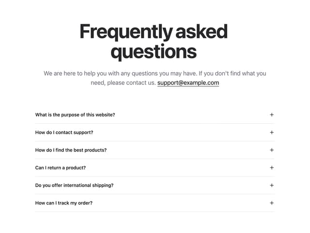
FAQ Accordion
167
Logo Cloud Marquee
162
Particles
100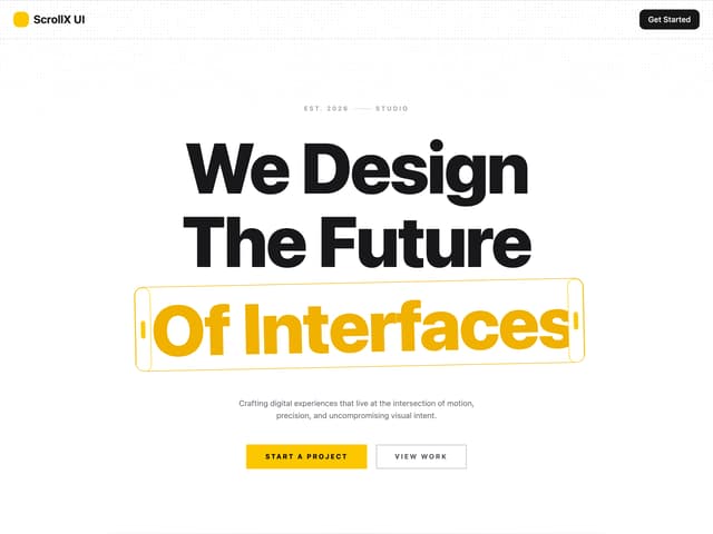
Hero With Pixel Background
92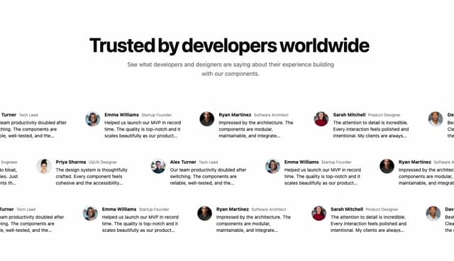
Testimonials Marquee
88
More in Cards
View all
Stats cards with links
40

Course Design Cards
1.2K

Interactive Tech Stack Bento Grid with Hover Effects
402

Card Studio
14

Statistics Card 2
291
Statistics Card 7
309
The Item one
3
Card
70
