
About
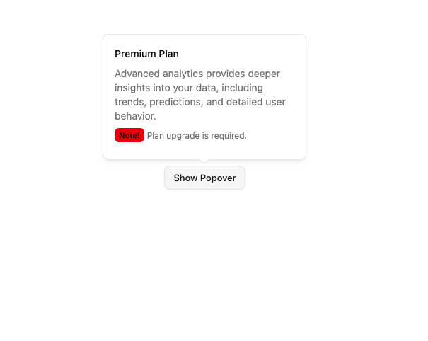
A floating panel that appears on demand. Built on top of Base UI Popover component with shadcn styling.
Built with React and Tailwind. Copy the prompt and paste it into Claude Code, Cursor or Lovable: your agent adds Base Popover to your project and fits it to your theme.
Code
How Base Popover is used: the demo's code. The component's own source comes with a free account.
Usage.tsx
import { Badge } from '@/components/ui/base-badge';
import { Popover, PopoverContent, PopoverTrigger } from '@/components/ui/base-popover';
import { Button } from '@/components/ui/base-button';

export default function BasePopoverDemo() {
  return (
    <Popover>
      <PopoverTrigger render={<Button variant="outline" />}>Show Popover</PopoverTrigger>
      <PopoverContent className="max-w-[300px] text-sm space-y-2" side="top">
        {/* Title */}
        <p className="font-medium">Premium Plan</p>

        {/* Description */}
        <p className="text-muted-foreground">
          Advanced analytics provides deeper insights into your data, including trends, predictions, and detailed user
          behavior.
        </p>

        {/* Additional Note */}
        <p className="flex items-center space-x-1">
          <Badge variant="destructive" size="sm">
            Note!
          </Badge>
          <span className="text-xs text-muted-foreground">Plan upgrade is required.</span>
        </p>
      </PopoverContent>
    </Popover>
  );
}
Dependencies
More by Sean Hello
View all

3D Testimonails
3.4K
Line Charts 9
650
Alert
494
Line Charts 6
390
Area Charts 1
390
Scroll Area
376
Area Charts 2
318
Navigation Menu
313
More in Buttons
View all

Button Group
2

App Store Button
457

Eclipse Button
6
Texture Button
95
Button
5
Button Save
47
Base Button
3

HeroUI Button Group

