
About
Renders a clickable button or an element styled as a button with advance options
Built with React and Tailwind. Copy the prompt and paste it into Claude Code, Cursor or Lovable: your agent adds Button to your project and fits it to your theme.
Code
How Button is used: the demo's code. The component's own source comes with a free account.
Usage.tsx
import { Button } from '@/components/ui/button-1';

export const slug = "ghost";

export default function ButtonDemo() {
  return (
    <div className="flex items-center gap-2.5">
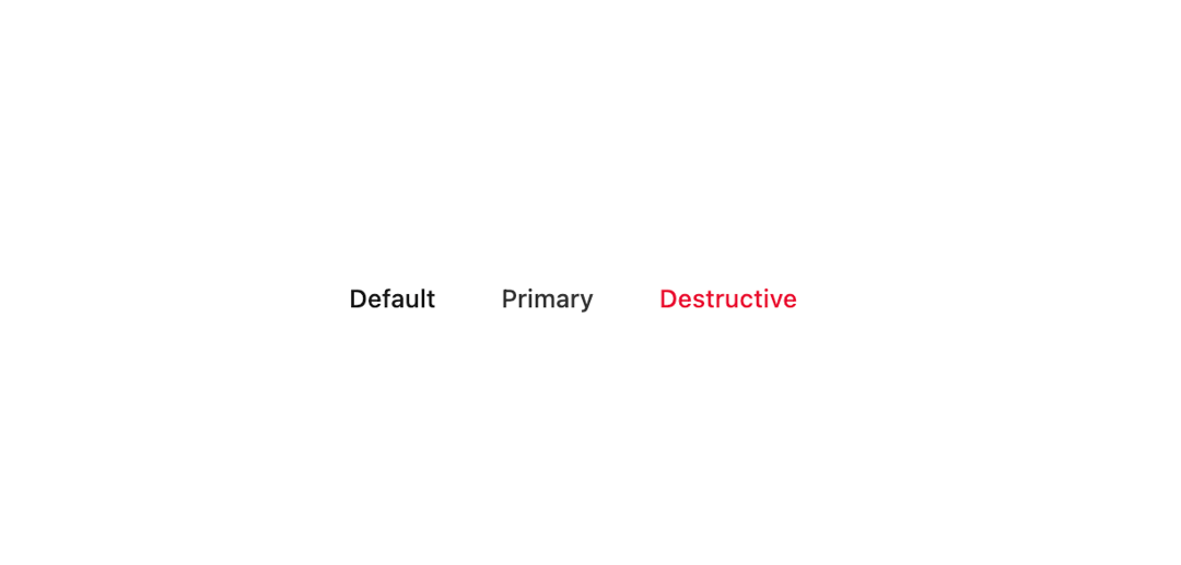
      <Button variant="ghost">Default</Button>
      <Button variant="primary" appearance="ghost">
        Primary
      </Button>
      <Button variant="destructive" appearance="ghost">
        Destructive
      </Button>
    </div>
  );
}
Dependencies
More by Sean Hello
View all

3D Testimonails
3.6K
Line Charts 9
693
Alert
502
Line Charts 6
407
Area Charts 1
399
Scroll Area
378
Navigation Menu
345
Area Charts 2
325
More in Buttons
View all
Button
10
Native Button
12

Eclipse Button
42
Texture Button
103
Button

Button
77

Notification Button
113

Button
34


