
About
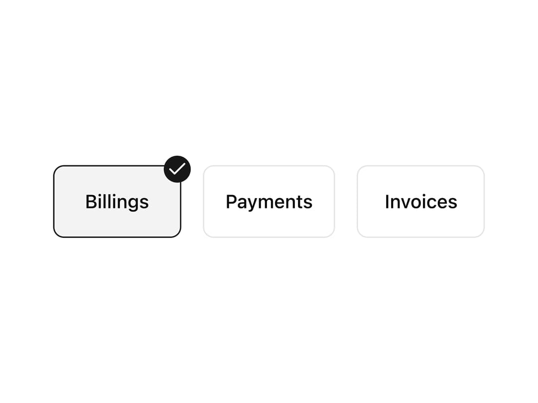
A checkbox field where the checkbox is positioned as a small circular badge in the corner of a labeled card, used to build selectable option cards for settings or plan choices.
Built with React and Tailwind. Copy the prompt and paste it into Claude Code, Cursor or Lovable: your agent adds Custom Positioned Checkbox to your project and fits it to your theme.
Code
How Custom Positioned Checkbox is used: the demo's code. The component's own source comes with a free account.
Usage.tsx
import { Checkbox } from "@/components/ui/checkbox";
import {
  Field,
  FieldGroup,
  FieldLabel,
  FieldTitle,
} from "@/components/ui/field";
import CCheckbox13 from "@/components/ui/c-checkbox-13";

export default function CCheckbox13Demo() {
  return <CCheckbox13 />;
}
More by Sean Hello
View all

3D Testimonails
3.5K
Line Charts 9
677
Alert
496
Line Charts 6
399
Area Charts 1
394
Scroll Area
378
Navigation Menu
336
Area Charts 2
321
More in Forms
View all

Contact Card
1.1K

Form
137

Premium Auth
540

Card Studio
45

Login 2
10
Login Card
30

Book A Demo 1
80
SignInPage
701

