
About
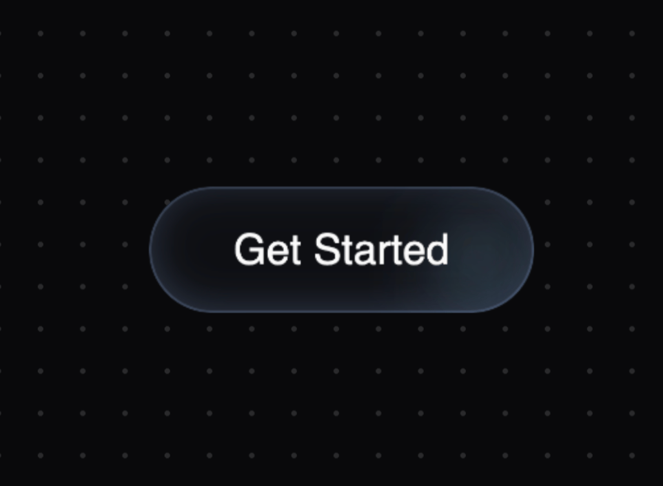
Button Hover Animation inspired by twitter.com/aaroniker_me
Built with React and Tailwind. Copy the prompt and paste it into Claude Code, Cursor or Lovable: your agent adds Hover Button to your project and fits it to your theme.
Code
How Hover Button is used: the demo's code. The component's own source comes with a free account.
Usage.tsx
import { HoverButton } from "@/components/ui/hover-button"

function HoverButtonDemo() {
  return (
    <div className="min-h-screen grid place-items-center">
      <HoverButton>Get Started</HoverButton>
    </div>
  )
}

export default { HoverButtonDemo };More by Serafim
View all
Spline Scene
9.8K
Testimonials with Marquee
2.4K
Gradient Button
2K
Pixel Canvas
927
Animated Blur Number
836
Empty State
800
Balloons
792
Status Badge
694
More in Buttons
View all
Texture Button
108
Button
14

Notification Button
117

HeroUI Button Group
2

Eclipse Button
44
Button Save
50

App Store Button
484

Base Button
1


