
About
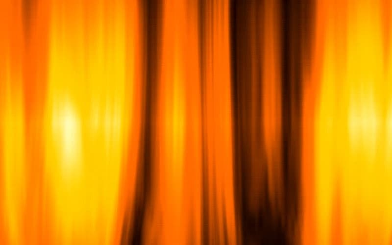
Animated WebGL shader background in the Aurora style, generated by the 21st.dev Shader Builder. 4-color palette (#140A00, #FF6D00, #FFC300, #FFF1B8). Features: high intensity. A drop-in, zero-dependency React component for hero sections and animated gradient/noise backgrounds.
Built with React and Tailwind. Copy the prompt and paste it into Claude Code, Cursor or Lovable: your agent adds Molten Pillars to your project and fits it to your theme.
Code
How Molten Pillars is used: the demo's code. The component's own source comes with a free account.
Usage.tsx
import { ShaderBackground } from "@/components/ui/molten-pillars"

export default function ShaderBackgroundDemo() {
  return (
    <div className="relative h-screen w-full overflow-hidden">
      <ShaderBackground className="h-full w-full" />
    </div>
  )
}
More by Serafim
View all
Spline Scene
9.7K
Testimonials with Marquee
2.4K
Gradient Button
2K
Pixel Canvas
923
Animated Blur Number
832
Empty State
794
Balloons
786
Status Badge
683
More in Heroes
View all

Responsive Hero Banner
2.1K

SaaS Template
2.6K

Hero
1.3K

Hero 03
356
Centered Hero with Image Fan
1K

Hero Section
438

HeroSectionWithGradient
372
Hero with text and two button
115
