About
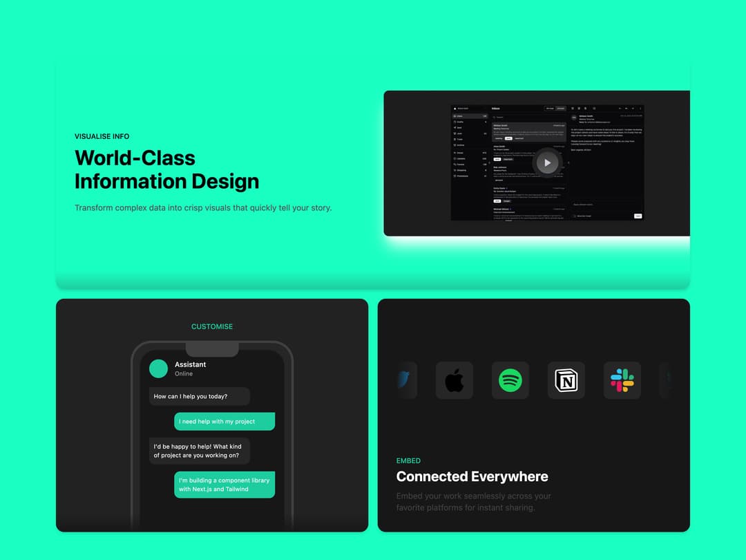
A three-panel bento-style grid section that combines a feature highlight with an image, an animated chat mockup, and a scrolling row of partner logos.
Built with React and Tailwind. Copy the prompt and paste it into Claude Code, Cursor or Lovable: your agent adds Bento Grid Feature Block to your project and fits it to your theme.
Code
How Bento Grid Feature Block is used: the demo's code. The component's own source comes with a free account.
Usage.tsx
import BentoGridOne from "@/components/ui/bento-grid-1";

export default function BentoGridOneDemo() {
  return <BentoGridOne />;
}
More by shadcn
View all

Navigation menu
803
Calendar with time pressets
527
Sidebar
359
Sonner
249
Chart
229
Icons
209
Dropdown Menu
160
Calendar with event slots
125
More in Features
View all

Grid Feature Cards
1.9K

Feature Sections
198

Features 8
3.2K
Feature with image
156
Features 2
347
Feature Section with card gradient
175
Features Card
263
Feature with advantages
297


