About
Displays rich content in a portal, triggered by a button.
Built with React and Tailwind. Copy the prompt and paste it into Claude Code, Cursor or Lovable: your agent adds Popover to your project and fits it to your theme.
Code
How Popover is used: the demo's code. The component's own source comes with a free account.
Usage.tsx
"use client";

import { Button } from "@/components/ui/button";
import {
  Command,
  CommandEmpty,
  CommandGroup,
  CommandInput,
  CommandItem,
  CommandList,
} from "@/components/ui/command";
import { Label } from "@/components/ui/label";
import { Popover, PopoverContent, PopoverTrigger } from "@/components/ui/popover";
import {
  Blocks,
  Brain,
  ChevronDown,
  Cpu,
  Database,
  Globe,
  Layout,
  LineChart,
  Network,
  Search,
  Server,
} from "lucide-react";
import { useId, useState } from "react";

const items = [
  {
    value: "analytics platform",
    label: "Analytics Platform",
    icon: LineChart,
    number: 2451,
  },
  {
    value: "ai services",
    label: "AI Services",
    icon: Brain,
    number: 1832,
  },
  {
    value: "database systems",
    label: "Database Systems",
    icon: Database,
    number: 1654,
  },
  {
    value: "compute resources",
    label: "Compute Resources",
    icon: Cpu,
    number: 943,
  },
  {
    value: "network services",
    label: "Network Services",
    icon: Network,
    number: 832,
  },
  {
    value: "web services",
    label: "Web Services",
    icon: Globe,
    number: 654,
  },
  {
    value: "monitoring tools",
    label: "Monitoring Tools",
    icon: Search,
    number: 432,
  },
  {
    value: "server management",
    label: "Server Management",
    icon: Server,
    number: 321,
  },
  {
    value: "infrastructure",
    label: "Infrastructure",
    icon: Blocks,
    number: 234,
  },
  {
    value: "frontend services",
    label: "Frontend Services",
    icon: Layout,
    number: 123,
  },
];

function Component() {
  const id = useId();
  const [open, setOpen] = useState<boolean>(false);
  const [value, setValue] = useState<string>("");

  return (
    <div className="space-y-2 min-w-[300px]">
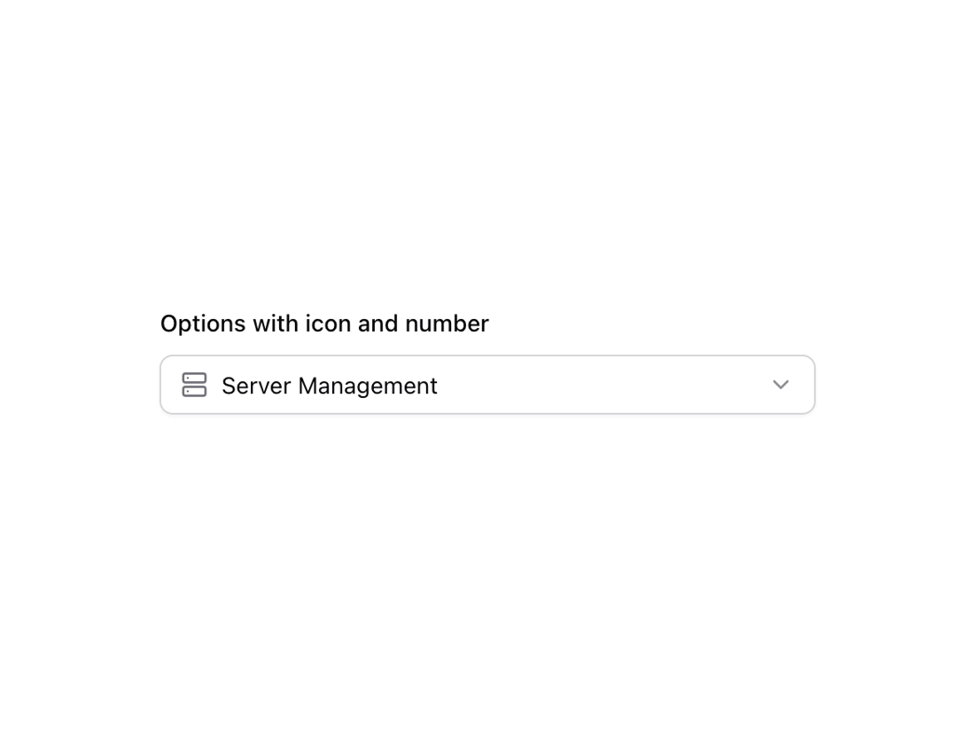
      <Label htmlFor={id}>Options with icon and number</Label>
      <Popover open={open} onOpenChange={setOpen}>
        <PopoverTrigger asChild>
          <Button
            id={id}
            variant="outline"
            role="combobox"
            aria-expanded={open}
            className="w-full justify-between bg-background px-3 font-normal outline-offset-0 hover:bg-background focus-visible:border-ring focus-visible:outline-[3px] focus-visible:outline-ring/20"
          >
            {value ? (
              <span className="flex min-w-0 items-center gap-2">
                {(() => {
                  const selectedItem = items.find((item) => item.value === value);
                  if (selectedItem) {
                    const Icon = selectedItem.icon;
                    return <Icon className="h-4 w-4 text-muted-foreground" />;
                  }
                  return null;
                })()}
                <span className="truncate">
                  {items.find((item) => item.value === value)?.label}
                </span>
              </span>
            ) : (
              <span className="text-muted-foreground">Select service category</span>
            )}
            <ChevronDown
              size={16}
              strokeWidth={2}
              className="shrink-0 text-muted-foreground/80"
              aria-hidden="true"
            />
          </Button>
        </PopoverTrigger>
        <PopoverContent
          className="w-full min-w-[var(--radix-popper-anchor-width)] border-input p-0"
          align="start"
        >
          <Command>
            <CommandInput placeholder="Search services..." />
            <CommandList>
              <CommandEmpty>No service found.</CommandEmpty>
              <CommandGroup>
                {items.map((item) => (
                  <CommandItem
                    key={item.value}
                    value={item.value}
                    onSelect={(currentValue) => {
                      setValue(currentValue === value ? "" : currentValue);
                      setOpen(false);
                    }}
                    className="flex items-center justify-between"
                  >
                    <div className="flex items-center gap-2">
                      <item.icon className="h-4 w-4 text-muted-foreground" />
                      {item.label}
                    </div>
                    <span className="text-xs text-muted-foreground">
                      {item.number.toLocaleString()}
                    </span>
                  </CommandItem>
                ))}
              </CommandGroup>
            </CommandList>
          </Command>
        </PopoverContent>
      </Popover>
    </div>
  );
}

export { Component };
Dependencies
More by shadcn
View all

Navigation menu
782
Calendar with time pressets
512
Sidebar
345
Sonner
236
Chart
220
Icons
189
Dropdown Menu
153
Calendar with event slots
119