About
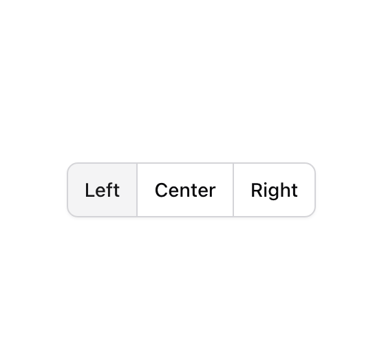
A set of two-state buttons that can be toggled on or off.
Built with React and Tailwind. Copy the prompt and paste it into Claude Code, Cursor or Lovable: your agent adds Toggle Group to your project and fits it to your theme.
Code
How Toggle Group is used: the demo's code. The component's own source comes with a free account.
Usage.tsx
import { ToggleGroup, ToggleGroupItem } from "@/components/ui/toggle-group";

function Component() {
  return (
    <ToggleGroup
      variant="outline"
      className="inline-flex gap-0 -space-x-px rounded-lg shadow-sm shadow-black/5 rtl:space-x-reverse bg-background"
      type="single"
    >
      <ToggleGroupItem
        className="rounded-none shadow-none first:rounded-s-lg last:rounded-e-lg focus-visible:z-10"
        value="left"
      >
        Left
      </ToggleGroupItem>
      <ToggleGroupItem
        className="rounded-none shadow-none first:rounded-s-lg last:rounded-e-lg focus-visible:z-10"
        value="center"
      >
        Center
      </ToggleGroupItem>
      <ToggleGroupItem
        className="rounded-none shadow-none first:rounded-s-lg last:rounded-e-lg focus-visible:z-10"
        value="right"
      >
        Right
      </ToggleGroupItem>
    </ToggleGroup>
  );
}

export { Component };
Dependencies
More by shadcn
View all

Navigation menu
782
Calendar with time pressets
515
Sidebar
348
Sonner
236
Chart
221
Icons
193
Dropdown Menu
154
Calendar with event slots
119
More in Buttons
View all
Texture Button
98

Button
1
Button
68

Eclipse Button
3
Button
65

HeroUI Button Group
2
Base Button
4

App Store Button
459

