
About
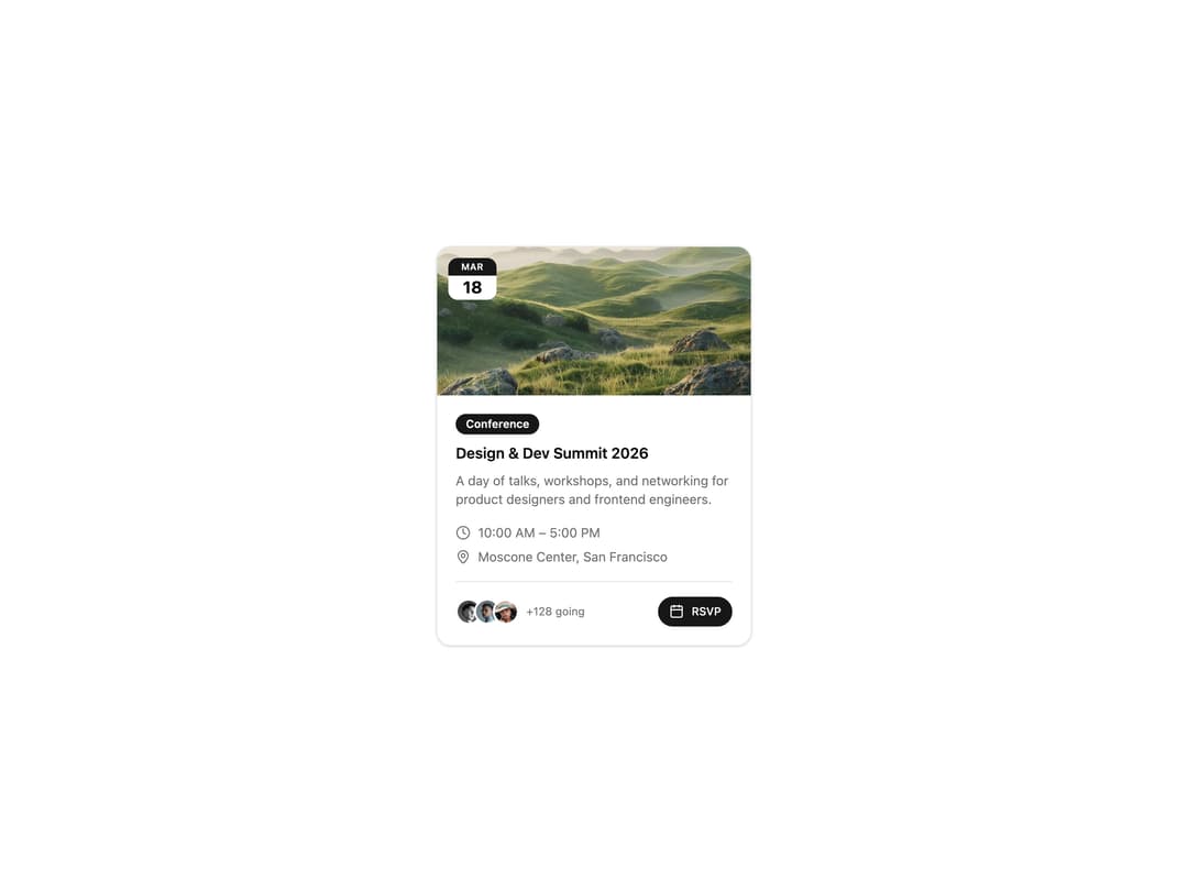
An animated event card with a cover image, floating date badge, staggered content reveal, time/location details, an attendee avatar stack, and an RSVP button.
Built with React and Tailwind. Copy the prompt and paste it into Claude Code, Cursor or Lovable: your agent adds Animated Event Card to your project and fits it to your theme.
Code
How Animated Event Card is used: the demo's code. The component's own source comes with a free account.
Usage.tsx
import EventCard from "@/components/ui/card-24";

export default function EventCardDemo() {
  return (
    <div className="flex items-center justify-center min-h-screen bg-background">
      <EventCard />
    </div>
  );
}
Dependencies
More by ShadcnSpace
View all
Integration Card
1.9K
Stacked Card Carousel
1.6K
Button witn Icon
1.5K
Orbiting Circles with Globe
1.4K
Agency Hero Section
1K
Testimonials Marquee
668
Shine Border
492
Range Select Calendar
490
More in Cards
View all

Course Design Cards
1.3K

Card Studio
12

Statistics Card 2
305

Interactive Tech Stack Bento Grid with Hover Effects
620

Card
19
Statistics Card 7
327
Card
61
The Item one
4