
About
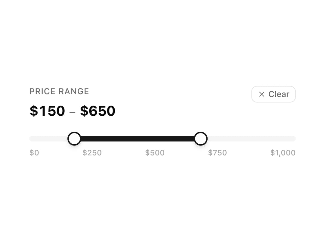
A dual-thumb price range filter slider that previews a ghost extension when hovering outside the selected range, with animated number values and thumb scaling.
Built with React and Tailwind. Copy the prompt and paste it into Claude Code, Cursor or Lovable: your agent adds Price Range Slider to your project and fits it to your theme.
Code
How Price Range Slider is used: the demo's code. The component's own source comes with a free account.
Usage.tsx
import Slider06 from "@/components/ui/slider-06";

export default function Slider06Demo() {
  return (
    <div className="flex min-h-[400px] w-full items-center justify-center p-8">
      <Slider06 />
    </div>
  );
}
Dependencies
More by ShadcnSpace
View all
Integration Card
1.9K
Stacked Card Carousel
1.5K
Button witn Icon
1.4K
Orbiting Circles with Globe
1.4K
Agency Hero Section
868
Testimonials Marquee
622
Shine Border
480
Social Icon
457
More in Forms
View all

Premium Auth
543

Contact Card
1.1K

Form
17

Card Studio
46

Book A Demo 1
80

Login 2
10

Login 1
58
SignInPage
710
